Smartial Wayback Machine Text Extractor
However, it is different from the archived page (2 redirect/s found...)
This article contains 21 images. You will find them at the very end of the article.
This article contains 30347 words.
Web Directions » Tutorials
Web Directions » Tutorials http://www.webdirections.org Awesome conferences for web professionals. Tue, 04 Mar 2014 01:56:22 +0000 en-US hourly 1 http://wordpress.org/?v=3.5.2 Build a motion activated security camera, with WebRTC, canvas and Device Orientationhttp://www.webdirections.org/blog/build-a-motion-activated-security-camera-with-webrtc-canvas-and-device-orientation/ http://www.webdirections.org/blog/build-a-motion-activated-security-camera-with-webrtc-canvas-and-device-orientation/#comments Fri, 07 Jun 2013 01:43:40 +0000 John http://www.webdirections.org/?p=4693 As a web developer, you’ve probably seen emerging HTML5 technologies and APIs like DeviceOrientation and WebRTC (Web Real Time Communications), and thought “wow they look cool, but they are only for hard core gaming, video conferencing, and other such stuff, not for my every day development”. I’m firmly convinced that taking advantage of these capabilities is going to open up fantastic potential for developers, both for existing web sites, as well as entirely new web experiences. In this article, I want to talk about the latter.When we first moved into the Web Directions office, we had an old iMac (I mean old) set up as a motion activated security camera. One of the guys who used to share the office with us had built a very simple app that when it detected movement (I’m assuming by analysing images) it sent a photo to a specified email address. Sadly, the Mac and app went when the guy moved out. I say sadly, because a few months back we could really have done with this to help catch whoever came by one night at 3am, smashed in our door, and took several devices.
But then it occurred to me this is something we can build in the browser. All we’d need to do was
So, let’s get started. We’ll begin by detecting motion.
Detecting motion
You’re probably thinking, there’s an HTML API for this, DeviceMotion. Which is exactly what I thought. The problem is, while well supported in mobile and tablet browsers (these devices almost universally have gyroscopes for detecting their orientation in 3D space, and accelerometers for detecting their acceleration in 3D as well) it’s not supported in any desktop browser. But, there is a related API, DeviceOrientation which reports the angle at which the device is in 3 dimensions, and which is supported in Chrome, when the laptop it is running on has the sensors to provide this data (I know that the MacBook Pro, but not Air support DeviceOrientation). DeviceMotion and DeviceOrientation work similarly. They both are events sent to the window object when something changes about the device. We can provide event listeners for these events, then respond to the data they provide.
Let’s create event handlers for each of these kinds of event
if (window.DeviceMotionEvent) { window.addEventListener('devicemotion', motionHandler, false) } else if (window.DeviceOrientationEvent) { window.addEventListener('deviceorientation', orientationHandler, false) }For each type of event, we make sure that the window object supports the event type, and if it does we add an event listener to the window for the type of event.
Ok, so now our Window can receive these events, let’s look at what information we get from each event, and how we can detect whether the device is in motion.
As mentioned, the most logical way to do so is via DeviceMotion, but here’s the complication. An ideal device for using as a security camera is an old laptop. It’s powered, so the battery won’t go flat, and on tablets, only Chrome for Android supports getUserMedia, for operating the device’s video camera. But, we can use DeviceOrientation to detect motion as we saw on some laptops in Chrome. Let’s do that first, then quickly look at how we can do the same thing for devices which support DeviceMotion events.
Here’s our handler for DeviceOrientation events.
function orientationHandler (orientationData){ var today = new Date(); if((today.getTime() - lastMotionEvent) > motionInterval){ checkMotionUsingOrientation(orientationData) lastMotionEvent = today.getTime() } }and similarly, our handler for DeviceMotion events
motionHandler: function (motionData){ var today = new Date(); if((today.getTime() - lastMotionEvent) > motionInterval){ checkMotionUsingMotion(motionData) lastMotionEvent = today.getTime() } }Because DeviceMotion and DeviceOrientation events fire many many times a second, if we were to respond to every single such event, we’d have a very warm laptop, and on battery powered devices, much shorter battery life. So, here we check the current time, and only if the time since we last responded to this event is greater than some interval we respond to the event. Checking for movement a few times every second should be more than adequate.
The event listeners receive deviceOrientation events, with data about the event, including information about the device’s orientation around 3 axes—alpha, beta and gamma.
- alpha is the device’s rotation around the z axis, an imaginary line extending out vertically from the middle of the device when it is lying flat on its back. In theory, alpha=0 is facing east, 90 is facing south, 180 is facing west, and 270 is facing north, but due to practical reasons, alpha is really only accurate for relative motions, not absolute directions, and so for example can’t be used to create a compass.
- beta measures the rotation around the x axis, a line horizontally through the device from left to right. 0 is when the device is flat, positive values are the number of degrees that the device is tilted forward, and negative values, the number of degrees it’s tilted backwards
- gamma measures the device’s rotation around the y axis, a line horizontally along the plane of the devices keyboard (or screen). Positive values at the number of degrees it’s tilted to the right, and negative values, the number of degrees it’s tilted to the left
Responding to the event
So, here’s how we’ll respond to the the event, and determine whether the device has moved.
function checkMotionUsingOrientation(orientationData){ //detect motion using change in orientation var threshold = .7; //sensitivity, the lower the more sensitive var inMotion = false; var betaChange = orientationData.beta - lastBeta //change in beta since last orientation event var gammaChange = orientationData.gamma - lastGamma //change in gamma since last orientation event inMotion = (Math.abs(orientationData.beta - lastBeta) >= threshold ) || (Math.abs(orientationData.gamma - lastGamma) >= threshold) //if the change is greater than the threshold in either beta or gamma, we've moved if (inMotion) { //do something because it is in motion } } lastBeta = orientationData.beta; lastGamma = orientationData.gamma; //now we remember the most recent beta and gamma readings for comparing the next timeThe orientationData argument is our deviceOrientation event. Along with the sorts of information we’d expect from any event, it has 3 properties, alpha, beta and gamma, with no prizes for guessing what these contain.
What our function does is gets the beta and gamma values from the event, and subtracts the difference from the last time we measured these. If either of these differs by more than some threshold we’ve set (in this case a little under 1 degree) then we’ve detected a movement. We finish by storing the most recent beta and gamma values. We’ve not bothered with alpha values, because Chrome, at present the only browser to report these values on the desktop, doesn’t report alpha values, and because moving a device only around one axis is extremely difficult, so if there’s movement around beta or gamma, then that’s good enough for our purposes. Essentially when the device is lying flat on its back, anyone walking in the vicinity will trigger this event.
How about doing the same thing when device motion events are supported? This time, instead of reporting the devices orientation in space, we get information about its acceleration in each of the same axes, x, y and z.
- motionData.acceleration.x is the acceleration of the device, in metres per second per second (ms^2), to the right (relative to the device) (so negative values are acceleration to the left)
- motionData.acceleration.y is the acceleration of the device, in metres per second per second (ms^2), forward (relative to the device) (negative values are acceleration “backwards”)
- motionData.acceleration.z is the acceleration of the device, in metres per second per second (ms^2), upwards (relative to the device) (negative values are downwards)
Here’s how we’d use this to detect motion.
checkMotionUsingMotion: function(motionData){ //agorithm courtesy //http://stackoverflow.com/questions/8310250/how-to-count-steps-using-an-accelerometer var threshold = 0.2; var inMotion = false; var acX = motionData.acceleration.x; var acY = motionData.acceleration.y; var acZ = motionData.acceleration.z; if (Math.abs(acX) > threshold) { inMotion = true } if (Math.abs(acY) > threshold) { inMotion = true } if (Math.abs(acZ) > threshold) { inMotion = true } if (inMotion) { //do something because it is in motion } }Here we take the acceleration in each axis, and if any of these is greater than a threshold amount (to ensure we don’t get false positives) then we’re in motion. You can see it’s a little simpler than using deviceOrientation, as we don’t need to calculateany change.
Taking the photo
So now we can detect when the device is moving, we want our security camera to take a photo. How are we going to do this? Well, one feature of WebRTC is the ability to capture video with a device’s video camera. At present, this is supported in Firefox and Chrome on the desktop, and the Blackberry 10 Browser (which also supports devicemotion events, so your Blackberry 10 phone or Playbook can serve as a security camera if you need it!), as well as Chrome for Android (though you need to enable it with chrome://flags). WebRTC is a very powerful API, but we’re only going to need a small part of it.
We’ll use the getUserMedia method of the navigator object. This takes an options object, as well as a success and a failure callback function as its arguments.
var options = {video: true}; navigator.getMedia(options, gotVideoStream, getStreamFailed);Our options variable is a simple object, here we just set its property video to true (if we wanted audio we’d also set an audio property to true).
We’ve also passed it two callback functions, gotVideoStream, which will be called once a video stream is available, and getStreamFailed, which is called if we don’t get a video stream (for example, if the user refuses the browser’s request to use the video camera). getUserMedia uses callbacks, rather than returning a value, because it takes time for the user to choose whether to allow video to be enabled, and as JavaScript is single threaded, this would block our UI while the user waited.
Next, let’s use video stream.
function gotVideoStream(stream) { var videoElement = document.querySelector("video"); videoElement.src = window.URL.createObjectURL(stream); }OK, there’s a bit going on here, so let’s take it one step at a time. Navigator calls our callback function, passing an argument stream. This is a MediaStream object. We then use the createObjectURL method of the window’s URL object to get a URL for the stream (this way we can then make this URL the value of the src attribute of a video element, then this video element will show the output of our camera in real time!).
So, we’ve now got a working video camera, that shows the video feed from our devices camera in a web page. No servers, no plugins! But we still don’t quite have our security camera. What we need to do is take a snapshot from the video stream, when we detect movement. So, let’s first take the snapshot
Taking a snapshot from the video element
Here we’ll take a snapshot of the video element at a given time. Note this works regardless of what’s playing in the video element (so you can do a screen grab of anything playing in an HTML5 video element like this). Ready?
function takeSnapshot(){ var canvas = document.querySelector("canvas"); var context = canvas.getContext('2d'); var video = document.querySelector("video"); context.drawImage(video, 0, 0); }Here’s what we’re doing
- we get a canvas element from the page
- we get its 2D drawing context
- we get the video element from the page
- we use the drawImage method of the canvas to draw the video into the canvas starting at (0, 0) (the top left of the canvas).
Yes, it really is that easy. Just as you can use canvas.drawImage with an img element, we can use it with a video element.
Now we’ve got all the pieces, let’s put them together to create our security camera.
Remember this part of our motion detection functions?
if (inMotion) { //do something because it is in motion }This is where we call takeSnapshot, and then the current frame in the video element will be captured to a canvas element. You could also save this in localStorage, or send it via email to someone, or otherwise do something with the image. I’ll leave those parts to you.
And that’s really all there is to it.
I’ve also got a fully working version available on github. It’s a little more complicated to read through than the code here, but it’s copiously commented, and the basic working code is the same. Or you can see it in action here (just make sure you use Chrome with a device that supports orientation events, and has a webcam).
Notes for those following along
Note though, to make it work from your local drive, you’ll need to run it through a webserver (Chrome won’t enable the camera from file:// although Firefox will). You’ll also need a device that supports either device orientation or device motion events, which to my knowledge currently means only a MacBook Pro (not MacBook Air).
Links for further reading
Som more reading on the various features we used to build our security camera.
- The getUserMedia Specification at the W3C
- Capturing Audio & Video in HTML5 from HTML5 Rocks
- DeviceMotion and Orientation Events specification at the W3C
- This End Up: Using Device Orientation from HTML5 Rocks
- Cross-browser camera capture with getUserMedia/WebRTC
- createObjectURL at Mozilla Developer Network
Cookies are designed for communication between the browser and a server that persists between sessions. They’re typically used for identifying a user on return visits and storing details about that user. Cookies are sent between the browser and server in plain text, unencrypted, each time the user opens a page. So, unless an application encrypts cookie contents, these can be quite trivially be read particularly on public wifi networks, when used over standard HTTP (though less easily over encrypted HTTPS).
Storing all client data on the server creates usability issues as well, as users need to log in each time they use that site. And of course the heavy lifting of ensuring data is secure during transmission, and on the server is left to you as the developer. And it’s rather tricky to build apps which work when the user is offline if the user’s data is all stored on the server.
As web applications become increasingly sophisticated, developers need ways to keep data around in the browser (particularly if we want our applications to work when the user is offline).
Two closely related but slightly different W3C technologies exist to help keep track of information solely in the browser. They enable far more structured data than cookies, are much easier for us to use as developers, and the information stored can only be transmitted to a server explicitly by the application.
sessionStorage stores data during a session and is removed once a session is finished. localStorage is almost identical, but the data stored persists indefinitely, until removed by the application. Let’s start with sessionStorage, keeping in mind that we use localStorage almost identically.
sessionStorage
What is a session?
The key feature of sessionStorage is that data only persists for a session. But just what is a session? HTML5 has the concept of a “top-level browsing context”. This is, in essence, a window or tab. A session lasts for that top-level browsing context while it is open, and while that top-level browsing context is pointed at the same domain (or strictly speaking, the same origin).
During the session, a user could visit other pages of the domain, or other sites entirely, then return to the original domain. Any data saved in sessionStorage during that session will remain available, but only to pages in the original domain, until the tab or window is closed.
If the user opens a link to your site in another tab or window, then there is no access to this sessionStorage, since this new tab or window is a new session.
It’s worth noting that sessionStorage is also shared with pages inside subframes in the same domain as the top level document in the window.
So, if we
- visit http://webdirections.org in a tab and save data to sessionStorage
- then follow a link to http://westciv.com in this same tab
- and then return to http://webdirections.org in the same tab
- we return to the same session for http://webdirections.org
- the data in the original sessionStorage is still available
If however we
- visit http://webdirections.org in a tab and save data to sessionStorage
- then follow a link to http://webdirections.org in a new tab
- the data in the original sessionStorage is not available to this new tab (but is in the original tab)
The one exception to this is when a browser crashes, and is restarted. Typically, browsers will in this case reopen all the windows that were open when the browser crashed. The specification allows in this situation for sessionStorage to persist for reopened windows from before the crash (WebKit, Mozilla and Opera browsers support this, IE8 does not, though IE9 and up do).
Which may sound like a great boon for the user, but, as an application developer, you may wish to consider whether you in fact want to persist session data after a crash. A user may consider that when their browser crashes using a service like web mail or online banking at an internet café or other shared computer that their login details have been purged, but if these were stored in sessionStorage then the next user to launch the browser will resume the session that were current when the user crashed. Ruh-roh.
What good is sessionStorage?
So, what good is sessionStorage? Well, one very useful application would be to maintain sensitive information during a transaction, signup, sign in and so on, which will be purged as soon as the user closes a window or tab. It can be used to create a multi-page form or application, where the information in each page can persist, and then be sent to the server all at once when the transaction is complete. It also moves some of the heavy lifting for protecting sensitive data away from application developers to the browser developer.
Using sessionStorage
sessionStorage is a property of the window object in the DOM. Because it is as yet not universally supported, we’ll want to check that this property exists before we use it:
if (window.sessionStorage) { //we use sessionStorage } else { //we do something else, perhaps use cookies, or another fallback }Right, so now we have our sessionStorage object, how do we use it?
Key-Value Pairs
sessionStorage stores “key-value pairs”. Each pair is a piece of information (the value), identified by a unique identifier (the key). Both the key and the value are strings (more on the implications of this in a moment).
We use the setItem method of the sessionStorage object to store data like so:
//get the value of the input with id="name" var name = document.querySelector('#name').value; //store this value with the key "name" window.sessionStorage.setItem('name', name);Now we’ve stored the value of the input “name” in an item of the sessionStorage object called ‘name’. It will remain there until this window or tab is closed and it will then automatically be purged by the browser when the user closes the window or tab.
reading from sessionStorage
There’s not much point in storing these details if we can’t get them back at some point. We do this by using the function getItem of the sessionStorage object, using a single parameter, the key we used to set the item.
So, to get the value of the name, we’d use:
var name = window.sessionStorage.getItem('name');Non-existent items
Now, what happens if for some reason there’s no item in sessionStorage with the key we are trying to access? In place of a string value, it returns null, not the empty string. So, it’s worthwhile testing whether the result returned is not null before using it
var email = window.sessionStorage.getItem('email'); if(email!==null){ document.querySelector('#email').innerHTML = email; }Saving Data Between Sessions
When information is less sensitive, it may make sense to store it between sessions. Particularly as web sites become more application-like, and can increasingly work offline, saving preferences or the state of a document can make for much better usability.
My HTML5 and CSS developer tools do just this, using localStorage. That way, when someone returns to the tools, the last gradient or layout or transformation they built is waiting for them.
Best of all, using localStorage, for persistence between sessions, is almost identical to using sessionStorage.
window.localStorage
Instead of the sessionStorage object of the window, we use the localStorage object. All the methods of localStorage are the same as sessionStorage.
- we set items with setItem
- we get items with getItem
Because items on the localStorage will persist forever, we may want to delete them. We can do this with localStorage.removeItem(key), using the key for the item we want to remove.
If we want to delete the entire localStorage, we can use localStorage.clear(). But, be warned, anything your app has saved to localStorage for this user is gone for good.
sessionStorage in fact also has these methods, though we’re less likely to need them, as all of a sessionStorage is discarded by the browser when a session finishes.
Gotchas, Tips and Tricks
sessionStorage and localStorage store all data as strings
As mentioned earlier, the values stored in local and session storage are strings, which has a number of implications for developers.
In particular, when we store boolean values, integers, floating point numbers, dates, objects and other non-string values, we need to convert to and from a string when writing to and reading from storage.
There’s also a more subtle side effect of storing values as strings. JavaScript strings are UTF-16 encoded, which means each character is 2 bytes (in UTF-8 characters are one byte). This effectively halves the available storage space.
Private Browsing
Many browsers now have private (or ‘incognito’) browsing modes, where no history or other details are stored between sessions. In this situation, what happens with sessionStorage and localStorage varies widely by browser.
- Safari returns null for any item set using localStorage.setItem either before or during the private browsing session. In essence, neither sessionStorage nor localStorage are available in private browsing mode.
- Chrome and Opera return items set previous to private (“incognito”) browsing commencing, but once private browsing commences, treat localStorage like sessionStorage (only items set on the localStorage by that session will be returned) but like localStorage for other private windows and tabs
- Firefox, like Chrome will not retrieve items set on localStorage prior to a private session starting, but in private browsing treats localStorage like sessionStorage for non-private windows and tabs, but like localStorage for other private windows and tabs
Getters and Setters
In addition to using getItem and setItem we can use a key directly to get and set an item in sessionStorage and localStorage, like so (where the key is “keyName”):
var itemValue = window.localStorage.keyName;localStorage and sessionStorage Limits
The webStorage specification recommends browsers implement a 5MB limit on the amount of data localStorage or sessionStorage can save for a given domain. If you try to exceed the limit that various browsers have in place (for some browsers users can change this allowance) setItem throws an error. There’s no way of asking localStorage for the amount of space remaining, so it’s best to set item values with a try and catch for any error:
try { window.localStorage.setItem(key, value); } catch (exception) { //test if this is a QUOTA_EXCEEDED_ERR }If the available space for this localStorage is exceeded, the exception object will have the name "QUOTA_EXCEEDED_ERR" and a code of 22.
As mentioned, in JavaScript strings are UTF-16 encoded, which means they are 2-byte. So, when saving the string “John”, we are actually using 8 bytes, not 4. Which means instead of 5MB of storage space per storage area, we effectively have 2.5MB.
If the storage needs of your application are likely to exceed 5MB, then web databases are likely to be a better solution. However, the situation with web databases is complicated, with two different standards, one, webSQL widely supported but deprecated, and the other IndexedDB, currently supported only in Firefox, Chrome and IE10.
Storage Events
We can add an event listener to the window for storage events so that when a storage object has been changed (there’s a reason for the emphasis) then we can be notified and respond to those changes.
window.addEventListener('storage', storageChanged, false);Here, when localStorage is changed (by setting a new item, deleting an item or changing an existing item) our function storageChanged(event) will be called. The event passed as a parameter to this function has a property storageArea, which is the window’s localStorage object.
There are two things to be aware of with storage events.
- The event only fires if the storage is changed (not if it is simply accessed and not if we set an item to the same value that it currently has!)
- In the specification, the event is not received in the window or tab where the change occurred, only in other open windows and tabs that have access to this localStorage. Some browsers have implemented storage events in such a way that the event is also received by the window or tab which causes the change, but don’t rely on this.
webStorage Performance
Of late, a number of high profile, widely read articles critical of localStorage have been published, centring on its asserted performance shortcomings. The key criticism relates to the fact that webStorage is synchronous. This means a script using sessionStorage or localStorage waits while getItem, setItem and other storage methods are invoked. In theory, this can impact both the browser’s response to user input and execution of JavaScript in a page. In practice, I’d argue that this is not likely to be a significant problem for most cases.
I recently conducted some testing across a number of devices and browsers which demonstrates that even for poorly implemented code that does a very significant number of getItem and setItem operations, the performance of webStorage is unlikely to have significant impact.
Origin restrictions
We said earlier that that sessionStorage and localStorage are restricted to windows or tabs in the same domain, but in fact, the restriction is tighter than simply the top-level domain (such as webdirections.org)
To have access to each other’s webStorage, tabs or windows must have the same top-level domain (for example webdirections.org), subdomains (for example test.webdirections.org), and protocol (https://webdirections.org has a different localStorage from http://webdirections.org).
At first glance this might seem overly restrictive but imagine john.geocities.com having access to the localStorage of fred.geocities.org?
Browser Support and Backwards Compatibility
localStorage and sessionStorage are widely supported, from IE8 upwards and in all modern browsers, including mobile devices.
There are also several polyfills that allow for webStorage in browsers which don’t support it natively.
The Wrap
webStorage solves a long standing challenge for web developers — reliably and more securely storing data between sessions entirely on the client side. While there are assertions that performance limitations make localStorage “harmful”, in the real world, services like Google and Bing are using localStorage and performance experts like Steve Souders and Nicholas Zakas defend and advocate their use. That’s not to say webStorage is perfect or ideal in all situations. The synchronous nature of the API and 5MB limit per origin do mean that in certain circumstances an alternative may be required. webStorage is however eminently usable for a great many client side data storage needs.
Further Reading
- The ever reliable HTML5 Doctors on webStorage
- Opera Developer Network, another always useful place to visit, on webStorage
- All about local storage, from Mark Pilgrim’s excellent “Dive into HTML5″
- Remy Sharp on the state of support for offline events, and some workarounds
- A couple of articles from the Mozilla Hacks blog on web databases, the Road to IndexedDB and an introduction to IndexedDB
- MSDN’s introduction to IndexedDB (supported in IE10)
- An introduction to webStorage, also from MSDN
In this article, we’ll take a look at how to use 2D transforms and the various transform functions (such as scale and rotate). We’ll also, as always, look at some gotchas when first working with transforms, and once again, there’s a tool to help you play with transforms (I developed it some time ago, but I’ve updated it significantly for this article).
What transforms do
As in many cases, an example is worth a thousand words, so let’s take a look at a couple, to illustrate how transforms work, as well as some of their most important aspects.
When you click or tap the button below, this paragraph is rotated by 45 degrees. It’s also scaled to 75% of the size it would otherwise be. However note how the rest of the page layout is not affected. That’s because transformations don’t change the box model of an element, and so leave the page layout unchanged.
This element has been skewed horizontally and vertically. You can still select the text, and otherwise interact with the element, as you would if it weren’t transformed.
Transforming elements
The syntax for CSS transforms is in many ways straightforward. There are just two new properties to contend with — transform, and transform-origin. The first specifies the transforms we want applied (scaling, rotating and so on), while the second, which is optional, specifies the origin for this transformation (for example, do we rotate around the middle of the element, its top left hand corner, and so on).
The transform property
The transform property takes as its value one or more transform functions, which each specify a transformation. Let’s take a look at each of these different functions in detail. Functions all take the form of a function name, with a value inside round brackets (as indeed do all CSS functions). So for example, we translate horizontally with the function translateX(200px).
OK, enough preliminaries, let’s start in with some actual transforming. We’ll start with the translate function.
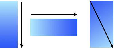
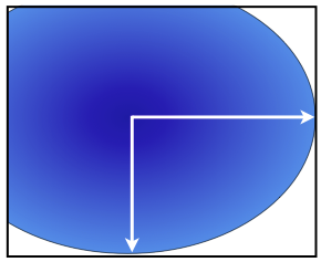
translate
The translate function moves the contents of an element to the left (negative values) or right (positive values), and/or upwards (negative values) and downwards (positive values).
translate takes one or two comma separated values. The first is the horizontal translation value. If there is a second, this is the vertical translation value, while if there is only one value, then the vertical translation is zero (that is, the element will only be translated horizontally).
In addition to the translate function, there are the related translateX and translateY functions, which only translate an element horizontally, or vertically, respectively. Translate functions take length or percentage values, and like CSS properties, require units for values other than zero.
But enough theory, why not have a play with them?
transform: translate(0, 0)
Translate X:
Translate Y:
We mentioned a moment ago that transforms don’t impact the layout of a page. There’s one area where this is not exactly true. If you translate the above element completely to the right, you’ll notice a horizontal scrollbar appears (or the page can now be scrolled to the right). While the page layout has not been changed, the overflow property of the transformed elements containing element is affected by transforms (Safari on Mac OS X Lion is an exception to this, and perhaps indicates where this sort of UX is headed, but for now, in desktop/laptop browsers other than this, the addition of a scrollbar will impact page layout).
This element is scaled by 200% when you click the button below. Its containing div has an overflow: auto. So, scrollbars appear when the element is transformed. In many browsers this will cause the page to reflow.
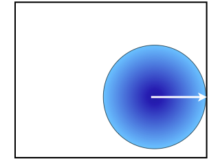
scale
The scale function lets us zoom an element up or down in size (all the while maintaining the dimensions of its box for the purposes of the layout of the page). The function name is scale, and it takes a number value-with a value of .5 meaning “scale to half the current size”, and of 2 meaning “scale to twice the current size”, and so on. So, if we want to make an element 75% of its current size, we use the property transform: scale(.75). And that’s really all there is to it. Why not have a play with it?
transform: scale(1)
scale:
It’s also possible to scale horizontally and vertically independently from one another, by using two comma separated numerical values for the scale property. The first value scales an element horizontally, and the second, vertically. Let’s take a look.
transform: scale(1, 1)
horizontal scale:
vertical scale:
As with translate there are two related scale functions, scaleX, and scaleY. scaleX scales only horizontally (scaleX(2) is the equivalent of scale(2, 1)), and scaleY, which scales only vertically (scaleY(2) is the equivalent of scale(1, 2)).
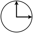
rotate
Rotating text and images is a common page design technique, until now difficult to achieve on the web without considerable hackery, if at all. Transforms make rotating an element easy.
The rotate function takes an angle value. If you’ve worked with CSS linear gradients, in particular the newer syntax, then you’ll have seen angle units before. There are several ways you can specify an angle in CSS.
degrees
As you most likely remember from school math, there are 360 degrees in a circle. So, when specifying a rotation of an element, 90 degrees is a quarter turn clockwise, 180 degrees is a half turn, 270 degrees is three quarters turn clockwise, and 360 degrees is a full revolution. Here these are below.
rotate(90deg) rotate(180deg) rotate(270deg) rotate(360deg)
Of course, it is possible to rotate an element by an arbitrary angle, for example 34.6 degrees, like so
rotate(34.6deg)
But, there are other ways we can specify rotations.
turnsperhaps the simplest way to specify a rotation is with the turn value. We can rotate an element a quarter turn clockwise with the function rotate(.25turn), half a turn with .5turn, three quarters of a turn with .75 turn, and a whole turn with the function rotate(1turn). WebKit and Opera support the turn value, while Firefox (version 6) does not.rotate(.25turn) rotate(.5turn) rotate(.75turn) rotate(1turn)
For completeness, it’s worth noting that there are two other possible angle units-radians (rad), and gradians (grad). Briefly, there are 400 gradians in a full rotation (so one grad is slightly larger than one degree), while there are 2π radians in a full rotation (radians are widely used in mathematics).
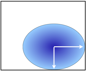
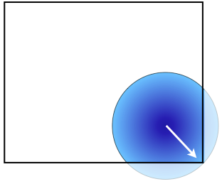
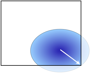
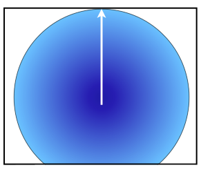
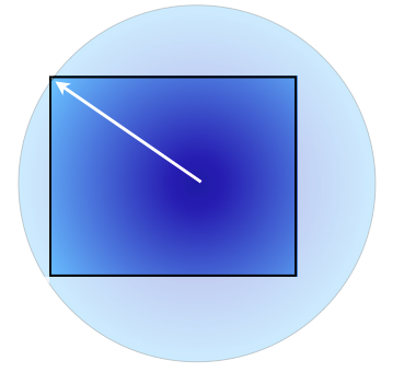
Now, if you think about rotating an element, then you might wonder what point of the element the rotation takes place around. For example — is it the center? Or one of the corners?
This element rotates around the top left hand corner when you click or tap and hold it. (transform: rotate(360deg))
We can in fact specify where the rotation (and as we’ll soon see, any transformation) takes place, using the transform-origin property. transform-origin takes two length or percentage values, which specify the horizontal and vertical “origin” of the transformation. In the above example, we have transform-origin: 0 0. If we want to rotate around the center of the element, we use transform-origin: 50% 50%, while to rotate around the bottom right of the element, we use transform-origin: 100% 100%.
This element rotates around the center of the element (transform-origin: 50% 50%; transform: rotate(360deg)).
This element rotates around the bottom right hand corner of the element (transform-origin: 100% 100%; transform: rotate(360deg)).
(You might be able to guess that we can animate transformation changes, like we can most other CSS property changes using CSS Transitions. For more on this, see my article on CSS transitions and animations.)
So, let’s now put rotations and transform origin together so we can play around with them.
transform: rotate(0); transform-origin: 0 0rotate:
Horizontal Origin:
Vertical Origin:
transform-origin can also be specified with keywords, in place of percentage (or length) values. As with background-position we can use left, center or right for the horizontal origin position and top, center or bottom for vertical. Where only one value is used, this applies to the horizontal origin, and the vertical is 50% (or center). Where no transform-origin is specified, its default value is 50% 50%.
skew
the last of the 2 dimensional transform functions is skew. Skewing is typically explained in mathematical terms, but if you recall a little school geometry, it isn’t really that complicated. Horizontal skew (the skewX function) takes the box of an element, and while the top and bottom edges remain horizontal, tilts the left and right edges by the specified number of degrees to create a parallelogram. Similarly, a vertical skew (skewY), leaves the left and right edges vertical, and creates a parallelogram with the top and bottom edges rotated by the specified number of degrees. And when you skew both horizontally and vertically, you combine both of these (where it can get really quite tricky to work out what’s going on). Does that help? You can play with the values below to get a sense of how skewing works in practice, including how it can create apparent 3D effects.
The skew function, like most other functions, takes one or two values. As with rotate, they are angle values, and where there are two values, they are comma separated.
transform: skew(0, 0)
horizontal skew:
vertical skew:
Once again, as with a number of the other transform functions we’ve seen, there are two related functions — skewX and skewY, which each skew only in one dimension, and which take only a single, angle value.
Complex transformations
While you’ll likely never need to use it, underneath all these functions is the core of CSS transformations, based on the mathematical concept of a transformation matrix. Each of the functions we’ve seen can be represented by a matrix value. While it’s firmly in the domain of mathematics, we can for example represent the function scale(1.5,1.2) by the matrix
1.5 | 0 | 0 0 | 1.2 | 0 0 | 0 | 1and directly apply this matrix value using the matrix function, like so
transform: matrix(1.5, 0, 0, 1.2, 0, 0)this element has been scaled using a matrix function on the transform property.
The transform matrices for various functions are described in the SVG specification.
Multiple transforms
It’s possible to apply multiple transform functions at once to an element. For example we can rotate, translate and skew an element with the single transform property:
transform: scale(0.75) rotate(45deg) translate(132px, -149px) skew(32deg, -32deg);Click the button below to apply several transformation functions simultaneously, with the property transform: scale(0.75) rotate(45deg) translate(132px, -149px) skew(32deg, -32deg);
There is however a complicating factor, which we look at in a moment.
The Transformer Tool
Hand coding transforms, as with much to do with CSS3, is an increasingly complex process. Not only is there a good deal of syntax to remember often for quite straightforward effects, but the outcome of at least some transforms isn’t necessarily obvious to most of us simply by looking at the CSS. So, to help you learn, and explore, CSS transforms, I’ve developed a 2D transform tool (there’s a 3D one as well, but we’ll cover 3D in a later article).
If you’re keen to explore transformations in more detail, and how they can be made to work together, head over and take a look, and as always, let me know what you think via twitter.
Gotchas, tips and tricks
Its fair to say that while now widely supported in modern browsers, 2D CSS transforms are still experimental, and quite quirky. Here are some of the difficulties you might encounter, and some tips and ideas for working with 2D transforms.
vendor specific prefixes
Reflecting the experimental nature of transforms, all browsers require vendor specific prefixes for the transform and transform-origin properties (note that function names are not prefixed). As all modern browsers including IE9 and up support 2D CSS transforms, using these transformation properties can get more than a little unwieldy. For example, the CSS for a simple rotation around the center of an element, if we include all vendor specific properties, would be something like:
img{ -webkit-transform: rotate(90deg); -moz-transform: rotate(90deg); -o-transform: rotate(90deg); -ms-transform: rotate(90deg); transform: rotate(90deg); //always include a standard for last -webkit-transform-origin: 50% 50%; -moz-transform-origin: 50% 50%; -o-transform-origin: 50% 50%; -ms-transform-origin: 50% 50%; transform-origin: 50% 50%; }You might find the use of a CSS preprocessor like LESS or SASS worth exploring, as they can make stylesheets far more manageable when you use a lot of vendor prefixing.
Transforming inline elements in webkit
According to the current version of the specification, CSS Transforms should be applied to inline, as well as block elements, but while Opera and Firefox both correctly apply transforms to inline elements, WebKit browsers (Safari 5.1, Chrome 15) currently don’t.
A workaround for this is to give inline elements which are to be transformed display: inline-block, which won’t affect how they are laid out in the page, but will enable these browsers to transform them.
Translating rotated content
One subtle aspect of multiple transformations is that functions are performed in sequence — from first to last in the list. The order that you specify functions can make a difference. Take a look at the following paragraphs. Both have the same scale, rotate and translate functions applied. But, in the first, the element is translated to the right, while in the second, it is translated to the left. What’s going on?
Clicking the button below applies several transformation functions simultaneously, with the property transform: scale(0.75) rotate(180deg) translate(-100px,0)
Clicking the button below applies several transformation functions simultaneously, with the property transform: scale(0.75) translate(-100px, 0) rotate(180deg)
Transformations don’t take place in an absolute coordinate space. Rather, “up”, “down”, “left” and “right” are relative to the current rotation (but not skew) of the element. So, if an element is rotated half a turn, and so is “upside down” then translate(0, –100px) moves it down the page 100px. If it’s rotated a quarter turn to the right, it’s moved to the left. Similarly, translating “horizontally” is always relative to the element. So, if it’s rotated by 180 degrees, then translate(100px, 0) moves the element to the left. In short, the X and Y axes of a transformation are relative not to the page, but the element’s current rotation.
Interacting with transformed content
While the box of an element isn’t changed by a transformation, elements that are transformed display various quirks when it comes to mouse events in various browsers, most likely due to the still experimental nature of transformations. Take the element below. It rotates a quarter turn clockwise when the mouse is over it, and then back to its original rotation when the mouse is out of it.
Now, if the box of the element isn’t changed, then when rotated, hovering over any of the image which is outside that original box should not trigger a mouseover event, and so the element should rotate back to its original position. However, as makes intuitive sense, hovering over those parts of the rotated element that are outside the original box does cause mouseover events to be fired. But in addition, mouseover events are also fired when you hover over that part of the element’s original box which no longer has content because it has been rotated away. And if you move your mouse around the element, you’ll find in all browsers various locations where the rotation abruptly, though unintuitively, changes. Similar behavior can be observed for translation and other transformations.
In light of this, I’d suggest being extremely wary of transforming elements which users will interact with given the current state of browser support for transformations.
Overflowing and transformations
We mentioned earlier that while transformations don’t effect the box model of an element, and so leave the layout of a page untouched, they do effect the overflow, and if we have overflow: auto, they can in fact impact the page flow.
In the element below, we have an image inside a div. The div has an overflow:auto. When we hover over the element (apologies to touch device users), the contained image scales up in size.
Now, in most browsers on most platforms (Safari on Mac OS X 10.7 is an exception) the browser adds a horizontal scrollbar to the div when you hover over the image, which adds to the height of the element, reflowing the page below it. Just something to be aware of.
CSS Positioning and Transforms
While I was writing this article, CSS legend Eric Meyer posted a detailed critique of one interesting aspect of transforms.
It has to do with the positioning of elements. When we absolutely or fixed position an element, and give it say a top and left, these positions are offset from their containing box — which is not necessarily their parent element. Rather, the containing box is the first ancestor which itself has either relative, absolute or fixed position. However, adding a transform to an element also makes it a containing block for its descendent elements! As Eric observes, this can particularly cause difficulties with fixed positioning. Rather than rehash Eric’s detailed thoughts, I’ll let you head over and read them first hand.
General Rendering Problems
On different browsers you’ll find various rendering problems with transformed content. For example, with Opera, rotated text appears to be rendered in a lighter font than the same text when it isn’t rotated. I’ve also seen redrawing problems when rotating text in WebKit browsers. In Safari on iOS 4, rotated text doesn’t necessarily align smoothly along its baseline. None of these are necessarily deal breakers, but it’s worth keeping in mind. Transforms are still experimental, so don’t necessarily expect them to be perfectly supported in all circumstances just yet.
Hardware Acceleration
There’s a widely held belief that at least some browsers hardware accelerate the rendering of CSS transformations (hardware acceleration involves the CPU handing off execution of certain types of calculation to the GPU, which can increase rendering performance significantly, particularly on mobile devices).
At present the current state of hardware acceleration for CSS transforms across all browsers and devices is difficult to pin down. A webkit engineer I tracked down confirmed that current versions of Safari (5.1 on the desktop, iOS 4), but not necessarily other WebKit browsers:
- animated 2D transforms in Safari are always hardware accelerated
- using 3D for static 2D transforms may improve performance, but may also increase memory use — a real issue for memory limited mobile devices in particular
Now, haven’t we just spent however much effort covering 2D transforms? How could this possibly help? Well, as we’ll see in an upcoming article on 3D transforms, we can use 3D transforms to do 2D transforms (for example, there’s rotate3D). If squeezing maximum performance for iOS devices is a need, then it may be that using a 3D version of a transform will help.
It’s also worth noting that issues around what aspects of CSS transforms are hardware accelerated and how that acceleration works are implementation details in specific browsers, and not specified as part of CSS Transforms. As such, across browsers there’s likely to be little uniformity of approach to hardware acceleration, and even from one version of a browser to the next, approaches may change.
Backwards Compatibility
One of the strongest aspects of CSS3 features like gradients, border-radius, shadows and the like is that they have been typically designed so as to be easily used in a way that is backwards compatible almost automatically, or provided we keep a small number of potential challenges in mind. For example, with gradients we need to ensure we have a fallback background color or image for when gradients aren’t supported. For text-shadow, we need to ensure that the contrast between the text and the element background is sufficient when the shadow is not drawn.
Of all new CSS3 properties, transform is the one where backwards compatibility is the most difficult to ensure. Ironically, it’s precisely because transforms don’t affect the page layout that they cause such difficulty. For example, in order to accommodate say a heading rotated 90 degree to run horizontally along the left hand side of the text which follows it, we need to create whitespace to ensure the heading does not overlap the text. We might do that with margin, or padding. We’re also likely to want to remove the whitespace where the heading has been rotated away from, by, for example, using negative margin on the paragraph following the heading. But, what happens if transforms aren’t supported? The heading text will be overlapped by the paragraph below it.
In order to use transforms for more sophisticated page layout along these lines, a solution like Modernizr, which enables different CSS to be applied based on the support, or absence of support for various CSS3 features like transforms is indispensable.
Transformations are typically most easily used in a way that is backwards compatible where animated transforms create a transition between states in an application. We’re all most likely used to sliding or flipping transitions between states in iOS and other mobile apps. CSS transforms can be used for these transitions, in conjunction with CSS Transitions, and where transforms aren’t supported (in which case it’s unlikely transitions will be as well), your users simply see an abrupt change in state.
However you plan to use transforms, as with every other aspect of web development, keep in mind those browsers which don’t support them, and ensure your user’s experience isn’t diminished to the point where information or functionality is denied them because their browser doesn’t support it.
Browser Support
As we mentioned, despite the still rather experimental nature of support for CSS 2D Transforms, they are now widely supported in modern browsers including:
- Internet Explorer 9 and up
- Firefox 3.5 up
- Safari 3.2 up
- Chrome 10 and up
- Opera 10.6 and up
- iOS 3.2 and up
- Opera Mobile 11 and higher
- Android 2.1 and up
So, support is widespread, and constantly improving. While there are definitely challenges associated with using 2D Transforms, they’re a powerful, and worthwhile addition to the repertoire of developers, and will only gain in value. What are you going to do with them?
More Reading
- The 2D Transforms Specification
- MSDN on Transforms — great to see the IE love for them!
- Opera’s developer center on, you guessed it, Transforms
- On Transformations in Internet Explorer (before and after IE9)
Newer iterations of the DOM provided developers with access to far more than just that original limited range of elements, as well as the ability to insert, modify and delete elements in an HTML document. But, cross-browser implementations very often differed, and full support for the W3C’s DOM standards have arguably been treated as far more optional than CSS or HTML support.
One of the many reasons for the success of JavaScript libraries like jQuery and Prototype, on top of their easing the pain of cross-browser development was how they made working with the DOM far less painful than it had previously been, and indeed how it was with the standard DOM. Being able to use arbitrary CSS selector notation to get matching elements from a document made the standard DOM methods seem antiquated, or at the every least, far too much like hard work.
Luckily, the standards and browser developers took notice. The W3C developed the Selectors API, a way of easily accessing elements in the DOM using standard CSS selector concepts, and browser developers have baked these into all modern browsers, way back to IE8.
In this short (by my standards) article, we’ll look at the Selectors API, how you use it, browser support, and some little things you might like to keep in mind while using it. Rest assured, it’s now widely supported, so in many cases, you can safely use it, potentially with a fallback for older browsers (IE7 and older specifically) via libraries like jQuery (or more lightweight selector engines like Sizzle, which provides this functionality for jQuery, and other libraries).
The Selectors API
The Selectors API, which many would consider to be part of HTML5, is in fact a separate, small specification from the W3C. It provides only two new methods, querySelector, and querySelectorAll, for the Document, Element, and DocumentFragment objects (typically, you’ll use these methods on the document or element objects.) But do these methods make life easier for developers?
Before the Selectors API, to access an object in the DOM we could use these methods:
- getElementById (from DOM Level 2 Core) — available for the document element
- getElementsByClassName, standardized in HTML5, after long non standard browser support, which is supported on documents and elements
- getElementsByTagName, from DOM Level 2 Core, available on the document and element objects
And there are some legacy ways of accessing elements on a page, which date from the earliest days of JavaScript:
- links is a property of the document object which contains all anchor (a) and area elements with an href attribute
- anchors is a property of the document object which contains all a elements
- forms is a property of the document object which contains all form elements
We can also “traverse” the DOM, using:
- childNodes, a property of the document and node objects
- nextSibling, a property of a node, which contains the element directly following it in the same parent element
- parentElement, a property of a node, which contains its parent element.
and related DOM traversal properties and methods.
But, what developers really often want to be able to do (as the success of jQuery and other libraries has shown) is simply say “give me all the elements which match this selector”, or “give me the first element which matches this selector”. And that’s precisely what the simple, powerful Selectors API does. It doesn’t completely do away with the need for DOM traversal, and legacy methods and properties, but it goes a long, long way.
querySelector
querySelector is a method of the document or any element, which returns the first descendent element which would be selected by its one argument, a CSS selector string. We can use this in place of the document.getElementById('content') like so: document.querySelector('#content') (like me, you’ll probably find yourself forgetting to add the # from time to time in querySelector, something which doesn’t throw an error, so can be frustrating to track down).
And we can do things like find the first header element in an HTML5 document, with querySelector('header'). So far so good. But where querySelector really shines is we can use any selector (attribute, structural, dynamic, UI, and even selector groups) with it. In most cases, this makes traversing the DOM, and locating a specific element far simpler, and most likely far quicker, as we won’t be looping in JavaScript and accessing all kinds of DOM properties, rather, the query is taking place inside the browser’s far faster native DOM engine.
querySelectorAll
Often, when working with the DOM, we want to manipulate several elements at once, For example, we might want to unobtrusively attach an event listener to all the links with a given class value. Here, querySelectorAll is your friend. Just like querySelector, it takes a single string as an argument, which is a CSS selector. Instead of returning a single element, it returns a NodeList (a kind of JavaScript array) of matching elements. We can then iterate through this array, and manipulate these objects.
For example, we could use it to replace document.links like so:
document.querySelectorAll('area[href], a[href]')This finds all area elements with the href attribute set, as well as all a elements with this attribute set as well (notice how we’ve used a selector group, which is quite acceptable with the Selectors API).
Matching elements are returned in the order they appear in the DOM parse tree.
Document or Element?
I mentioned that both the document, and element objects implement these two methods — what’s the difference? Well, as you might have guessed, these methods find elements that are descendants of the object you query on. So, if you use the method on a paragraph element, it will only find the descendant elements of that paragraph which match the selector. Other elements in the document which might match it won’t be returned. But, if you use the methods on the document, then any matching element in the document can be found.
Gotchas
If you’ve really got your hands dirty with the DOM, you’ll know that when DOM methods return a NodeList, it is live—that is, the members of the list change, depending on the state of the document.
Let’s say we get all the elements with a class of “nav” using document.getElementsByClassName('nav'), and it returns 5 elements, which we keep in a variable.
Now, if we add a new element with class nav, or remove one of the existing elements with a class of nav, the NodeList in our variable will be updated to reflect these changes (that’s why it is called a live NodeList).
But querySelector and querySelectorAll are different. While they return a NodeList, it is static. So, if we similarly get all elements with a class of nav using document.querySelectorAll('.nav'), then regardless of what we subsequently do to the DOM, the length and contents of the NodeList won’t change. Which means, it’s always best to query the DOM just before you need the elements, rather than holding on to elements if your DOM is going to change.
There’s also a performance consideration. Tests of various browsers indicate that querySelectorAll is slower than getElementByTagName (though not it would appear in Opera). But, it’s also possible that once available, manipulating the static NodeList may be higher performance than manipulating a dynamic NodeList. And this issue will likely only have an impact in extreme cases. I’d certainly not recommend prematurely optimising by using getElementsByTagName, getElementsByClass, getElementById and so on in place of querySelectorAll, but it is worth noting you might be able to squeeze a little more performance out by doing so if you really need to.
And it is worth noting too that querySelector and querySelectorAll don’t work with every kind of selector. While pseudo-class selectors (like :visited) work with these methods, pseudo-element selectors, like :first-letter, :first-line, :before and :after although permissible as arguments, will return null in the case of querySelector, and an array of length zero for querySelectorAll.
A little gotcha this aging developer has found I’m so used to getElementById and getElementsByClassName that I find myself forgetting the # or . required in the selector string in querySeletor and querySelectorAll. As I mentioned a moment ago, it can be frustrating, as this won’t throw an error, but simply return null or an empty NodeList.
Support
All modern browsers, including IE8 and up support both querySelector and querySelectorAll. It is however worth noting that the results returned are dependent on what selectors the browser supports. IE8 supports CSS2.1 selectors, though not CSS3 selectors. IE9 supports many CSS3 selectors, but not a number of the UI related pseudo-classes, such as :required and :invalid. IE CSS support for versions 5 through 9 is extensively covered here by Microsoft.
So, keep in mind, even where these methods are supported, what they return is only as good as the CSS selector support in that browser.
The Wrap-up
If you’re more of a web designer who’s always been a little intimidated by the thought of wading through the DOM in search of elements (trust me, even seasoned developers often wince at the thought), then querySelector and querySelectorAll are a boon for you. Or, if you’re a developer who finds yourself going straight for jQuery or another library as soon as the DOM is involved, the Selectors API might just save you a few KBs, additional files and fussing around. And, if you’re one of those seasoned DOM experts, I’m sure there’s plenty of times you’ll breathe a sigh of relief that rather than wading through an entire document with childNodes, nextElementSibling and the like, a single call to querySelectorAll will return all the elements you want. I reckon these two are my favourite, and now most used DOM methods, and I’m only surprised they aren’t more widely covered, as they really are like a Swiss Army Knife for the DOM. Perhaps we need a “top 2 Selectors API methods” article. Then again…
Reading
Here’s a few articles and other resources which delve into the Selectors API.
- The Selectors API specification from the W3C
- Selectors API at Opera Developers Center, by Lachlan Hunt, one of the authors of the spec.
- Selectors API at Mozilla Hacks
- Thoughts on performance from JS performance guru Nicholas Zakas (the comments are well worth reading)
A brief history on Animation of the Web
If you’ve been developing for, or even just using the web for more than about 15 years, you’ll likely remember a time when animated effects were the bomb. Animated GIFs adorned just about every page, spinning globes, little men with jack hammers, self-folding winged envelopes. And if you’re very unlucky, you’ll remember the explosion of blinking content on the web around 1995, as the blink element in the then dominant Netscape browser took hold of the imagination of designers everywhere (for killing off the non-standard blink element alone, the web standards movement deserves at the very least a Noble Peace Prize). And perhaps the single widest JavaScript use in its earliest days was for creating image rollovers, until CSS got into the act with the hover state. In short, animation has had a long, if checkered career on the web.
Then, for years, animation fell out of favour, but with the rise of JavaScript libraries, we’ve seen the re-emergence of animated interfaces.
CSS3 animation
In the last 2 or 3 years, CSS3 has got into the act, providing a reasonably straightforward declarative way of creating even quite sophisticated animations, where complex JavaScript had previously been required.
In this article we’ll take a look at two related ways CSS3 provides for creating animations and animated effects, CSS Transitions and CSS Animations. We’ll look at how to create them, browser support, some interesting gotchas, and yet again, I’ll introduce a tool, AnimatR, I’ve created to help you more easily, and quickly, create cross-browser CSS animations. But please use animations wisely, tastefully and sparingly — we’ve take nearly 15 years to recover from the “blink tag”. Let’s not wait until 2026 for our next opportunity to get animations on the web right.
The JavaScript controversy
First up, let’s address a now fading controversy. When CSS animations were first proposed and experimentally introduced in Webkit, (coming up on 4 years ago now), many prominent, thoughtful developers felt strongly that animations were rightfully the domain of JavaScript, not CSS. Among the strongest, and most articulate, of those critics was Jonathan Snook, who subsequently revisited his concerns, and changed his position. In short, the concern is that animation is a kind of behavior, considered the domain of JavaScript, not presentation, the domain of CSS. But the simplest way of understanding an animation is that it is the change of presentational aspects of an element (height, width, color, etc.) over time. In short, animations are presentation, even if prior to CSS3 Transitions and Animations, they could only be achieved via JavaScript.
We also increasingly have the benefit that CSS based animation is being hardware accelerated in browsers, making for smoother animations and transitions even on relatively low powered mobile devices.
Let’s begin with the simpler CSS Transitions, then continue with CSS Animations. Animations reuse many of the concepts, and even syntax of transitions, so what we learn about transitions we can apply with animations as well.
Transitions
In CSS3, there are two kinds of animated effects — transitions and animations, which work in very similar ways. You might even think of transitions as simple kinds of animations. Transitions are the animation from one set of an element’s CSS property values of to another set. At their simplest, that might be a smooth animation from a background-color of red to a background-color of green.
Animations enable multiple changes to the presentational properties of an element over time — for example a 2 second animation from background-color of red to green, then a 1 second transition back to red again, repeated indefinitely (we’ll see less boring, and more useful animation examples shortly).
First introduced in Webkit and now supported across all modern browsers, including IE10 developer previews, transitions allow us to animate the change in presentation between two states, that is two sets of CSS properties. At its simplest, a transition might be just a smooth change from one value of a property to another value, over a specified period of time — for example, the smooth change of height over 2 seconds. To create simple transitions, we use the transition-property property, with a space separated list of CSS properties to be animated, and the transition-duration property, to specify how long the animation should take.
Here’s a really simple example: let’s cross fade a background-color from red to blue in 2 seconds.
p { transition-property: background-color; transition-duration: 2s; background-color: red; }Which leaves one simple question to answer — how do we trigger the change, and so the animated transition? Well, here’s the deceptive simplicity of transitions — they take place any time the specified property (in this case background-color) changes. So, if the background-color changes because we have a different background-color specified for the hover or other state, or if we use JavaScript to change the background-color, then those changes in color will be animated! Let’s try it out. If we specify a different background-color when the paragraph is in a hover state, like so:
p:hover { background-color: blue; }Then any time you hover over a p element, the color will fade. Let’s see that in action below
In all modern browsers (except IE9) this background color should fade from red to blue when you hover over it
A little pro tip as we go along — make sure you put the transition properties (transition-property, transition-delay etc.) on the element in its normal, not hover state.
But what’s with the s unit for the transition-duration property? CSS has in fact had units of time since CSS2. Originally part of Aural Style Sheets, we can specify time in either seconds (s) or milliseconds (ms) — 1,000 milliseconds in a second. CSS3 Transitions and Animations reuse these units, which are also part of CSS3 of course.
So, hopefully the basic idea is clear — with transitions we tell a browser that when a certain property or set of properties change, the change should not be abrupt, but be animated over a certain time period. Now, you might have noticed in the transition above the text color changes too — but does so without an animation. That’s because we’ve only specified that the background-color have an animated transition, via transition-property. We can as mentioned specify multiple properties, by listing each in a comma separated list of property names like so:
transition-property: background-color, color;If we want all of the transitions to take the same amount of time, we can specify a single transition-duration property value. But, if we want different properties to transition over different time periods, we do so by listing the time values in a comma separated list — with the time periods and properties in the same position in their respective lists. Here for instance, the color will transition over 1s, while the background-color will do so over 2s:
p { transition-property: background-color, color; transition-duration: 2s, 1s; background-color: red; }And here this is in action:
In all modern browsers (except IE9) this background color should fade from red to blue when you hover over it, over a 2 second period, while the text color changes from black to green over 1 second.
If we want to animate the changes for any properties which change, we can use the keyword all as the value for transition-property. This will ensure that regardless of which property changes, that change will be animated (not all properties can in fact be animated — we’ll cover which ones can be shortly). Be careful with the all keyword — should future properties support animation, these will be animated, and it may not be clear at this stage just what these animations will look like.
There’s also the shorthand transition property which takes a space separated property name and time values like so:
p { transition: background-color 2s; }Note how there are no commas between the property and time value.
Or, if we have multiple property and time pairs, we separate each pair with a commas, like so
p { transition: background-color 2s, color 1s; }And in a nutshell, that’s the core of CSS3 transitions. We’ll touch on some gotchas (most of which are shared with animations) a little later. And we’ll take a look at browser support in detail in just a moment. But there are some optional features of transitions you might find useful, including specifying the nature of the transition, and a delay before a transition starts.
Transition Timing Functions
When a transition occurs, there are various ways the intermediate steps can take place. Let’s take the example of an element moving from left to right across the screen, over 2 seconds:
This element moves from left: 0% to left: 80% in 2s when you click it. It reverses this when you click it again.
Notice how it begins quickly, then slows down as the transition draws to an end. Now, take a look at the same transition below, with a very slight change.
This element moves from left: 0% to left: 80% in 2s when you when you click it. It reverses this when you click it again.
The difference between the two is they have different transition-timing-function properties. This property “describes how the intermediate values used during a transition will be calculated”. There are 5 timing function keywords (as well as some more complicated ways of describing timing functions mathematically using Bezier curves which we won’t go into here), ease, linear, ease-in, ease-out, ease-in-out.
Each of these is defined in mathematical terms in the specification, but it makes much more sense to let you see them all in action.
This transition has a timing function of ease, the default timing function. Click it to see it in action.
This transition has a timing function of linear. Click it to see it in action.
This transition has a timing function of ease-in. Click it to see it in action.
This transition has a timing function of ease-out. Click it to see it in action.
This transition has a timing function of ease-in-out. Click it to see it in action.
We specify an optional timing function (as noted above, the default is ease) using the property transition-timing-function, with one of the keywords above as its value. As mentioned, we can specify a timing function as a cubic Bezier curve, but if you need to get this technical with your transitions, the best place to understand the details is the specification.
Which timing function you choose is a matter of taste, and for most purposes, the default value of ease should be fine.
Delay
There may be occasions on which we want a transition to delay for a certain amount of time before commencing, and we can do this quite straightforwardly with the transition-delay property. As with transition-duration we do this using a time value in seconds or milliseconds.
transition-duration: 150ms;We can also specify different delays for different transitions, like this (click the element below to see the effect):
This element transitions the change of top value, but delays the transition on the change of left value for .5s.
transition-property: top, left; transition-duration: 2s, 1.5s; transition-delay: .5s, 0s;Browser Support and Backwards Compatibility
So, having introduced such a mouthwatering prospect for designers, just how useable is it today? In fact, surprisingly so. All modern browsers support transitions, including IE10 developer previews. Firefox has done so since version 4, Safari since 3.2, Chrome since at least version 9, Opera since 10.6, iOS since 3.2 and Android since 2.1.
It does need to be noted that not all browsers animate all property changes — we’ll look at this in a little more detail in the animations section, since the list of properties applies to both animations and transitions.
However, as yet, all browsers require vendor prefixes in front of all the properties for transitions — which can make for some unwieldy CSS.
Since transitions only animate changes in style that are triggered either by a change in state (like hover or focus) or via JavaScript, they are effectively backwards compatible to just about any browsers likely to be used today. Users of those browsers simply don’t see the intermediate steps between one state and the other, merely the abrupt transition they’d always have seen. We just need to ensure that in the absence an animated transition, no information is lost.
From a usability and accessibility perspective, we should also be mindful that flashing content can trigger seizures in some users, and that sudden movements of content (for example a block of content from one place to another) in the absence of an animated transition may be disorienting, particularly for users with cognitive disabilities.
Transitions are straightforward to use, widely supported, backwards compatible, and can add a little more to your site or application. However just make sure you don’t overdo them. Remember the <blink>.
Animations
Similar in many ways to transitions, CSS Animations allow us to create multi-step animated content using only CSS and HTML (though we will often want to use just a little JavaScript to trigger the animation).
I’ve mentioned that animations and transitions have a good deal in common — here’s a quick look at their similarities and differences.
Similarities between CSS Transitions and Animations
- Both animate the change in CSS property values over a period of time
- Both have a duration
- Both have an optional delay
- Both have an optional timing function, defined in the same way
Differences between CSS Transitions and Animations
- Animations can repeat any number of times
- Animations can be specified to go in a forward and reverse direction
- Animations can have any number of defined intermediate steps, called “keyframes”, but transitions only have a defined start and end “keyframes”.
- With transitions we can specify an animation for any property which changes, using the all keyword. With animations, we need to specify every property we want animated.
How CSS Animations are defined
Creating a CSS3 animation is a little more work than creating a transition, involving two interlinked steps.
We need to create a regular CSS rule, which selects the element or elements we want to be animated, and we give this rule a set of CSS properties related to animations (we’ll look at these properties in a moment).
We also create an @keyframes rule, similar to an @media rule, which defines the two or more keyframes in our animation. If we have simply two keyframes, for the beginning and end of our animation, a transition is most likely the better choice. Each keyframe specifies the state of the animated properties at that particular time during the animation.
While it might sound a little complicated, each step is quite straightforward. Let’s take a look at each in turn.
The animation properties
Just as with transitions, we specify various aspects like the duration and timing function of the animation using CSS properties. But first we need to declare which @keyframes rule will be used to specify the keyframes of our animation, which we do using the animation-name property. Animation names follow the same rules as HTML4 id values — alphanumeric characters, dashes and underscores, and begin with a letter. Here we’re specifying that the header element should be animated using an @keyframes rule with the name opening-sequence (we’ll see very shortly how we give @keyframes rules names).
header { animation-name: opening-sequence; }Notice how the animation-name value is not quoted.
We’ll return to familiar territory by specifying a duration and timing function for the animation, using the properties animation-duration and animation-timing-function. As with transitions, the duration is specified in seconds or milliseconds, while the timing function takes one of the keywords we saw earlier (or again a more complex formula we’ll not go into here).
header { animation-name: opening-sequence; animation-duration: 5s; animation-timing-function: ease-in; }As with transitions, we can also delay the beginning of an animation, here using the animation-delay property, with a value once again in s or ms.
header { animation-delay: 500ms; animation-name: opening-sequence; animation-duration: 5s; animation-timing-function: ease-in; }So far, all should be very familiar from transitions. Now we meet two new properties. The first is for specifying how often the animation runs (once, a certain number of times, or indefinitely). The other is for specifying what happens when a repeating animation completes — should it begin again from its initial state, or play the animation in reverse? Let’s take a look at each.
Specifying that an animation should run more than once is very straightforward. We use the animation-iteration-count property, and give it either a numerical value, or the keyword infinite. The animation then runs the specified number of times, or indefinitely. The delay in commencing the animation only applies to the very beginning of the animation, and there will be no delay between iterations.
When an animation does run more than once, for example if an element moves from left to right on the page, what should happen when the next loop of the animation begins? There’s two possibilities. The animation could begin where it did the first time — for example on the left, as in this example
animation-direction: normal;
Or, the animation could reverse direction, returning to the starting values, as the animation below does:
animation-direction: alternate;
We define this behavior using the animation-direction property, which takes one of two possible keyword values: alternate or normal. To achieve the first of the effects above, we use the animation-direction property with a value of normal. The second of the two has a value of alternate for the animation-direction property.
Now we’ve set up part one of our animation, it’s time to create the animation itself. As we’ve mentioned, this is done using an @keyframes rule. The form of this rule is:
@keyframes opening-sequence { 0% { /*properties to animate*/ } 20% { /*properties to animate*/ } 100% { /*properties to animate*/ } }That is, we start with the keyword @keyframes. This is followed by the animation name. Next, inside curly braces (}”{“ and ”}”) we have two or more keyframes. A keyframe has the form of a percentage value, and then a group of CSS properties inside their own curly braces.
The first keyframe must be 0%, and unlike elsewhere in CSS, the % is required. The last keyframe must be 100%. OK, so we can use the keyword from in place of 0% and to in place of 100%, but both the first and last keyframes must appear.
To create the animations above, we’d have this @keyframes rule:
@keyframes opening-sequence { 0% { left: 0%; } 100% { left: 80%; } }Note how our keyframes rule doesn’t have anything to say about the direction, duration, and so on. These are properties we specify for particular elements using the animation properties we’ve just seen. Both of the animations just above use the same @keyframes rule — they just have different animation-direction properties. Here are the complete rules for each of those animated elements
#normal-animation { background: red; position: relative; width: 20%; animation-name: opening-sequence; animation-duration: 5s; animation-iteration-count: infinite; animation-timing-function: ease; animation-direction: normal; } #alternate-animation { background: red; position: relative; width: 20%; animation-name: opening-sequence; animation-duration: 5s; animation-iteration-count: infinite; animation-timing-function: ease; animation-direction: alternate; }The only difference between the two is the value of the animation-direction property.
Let’s take a closer look at the @keyframes rule. Each keyframe is more or less like a regular CSS rule. In place of a selector like p.classname, it has a percentage value. The percentage value specifies where in the animation this keyframe belongs. For example a keyframe percentage of 40% in a 10 second animation occurs after 4 seconds.
It also has a declaration group of properties, separated by semicolons, as we’d find in a regular CSS rule. These define what the appearance of the selected element or elements should be at this point in the animation. The browser then animates the transitions between these keyframes.
Rather than go on in ever greater detail, perhaps the best way for you to get a better understanding of animations is to create some. And you don’t need to fire up a text editor, just head over to AnimatR, the tool I’ve developed to help you create animations. I’ll go into a bit more detail about how it works shortly, but it should make sense if you’ve read this far (and hopefully make more sense of what you have read).
Before and After Animation
Suppose we have this CSS
header { width: 90%; animation-name: opening-sequence; animation-delay: 2s; ... }And this animation
@keyframes opening-sequence { 0% { width: 40%; } 100% { width: 60%; } }What width is the element during the 2 second delay before the animation begins? What about after the animation completes? In both cases, it’s 90% (which may not be what you want). But we can specify that instead of the applied properties, the opening and closing keyframe properties should apply during the animation delay, and after the animation completes using the animation-fill-mode property.
animation-fill-mode can take the following keyword values:
nonethe default state, as described aboveforwardsthe properties from the 100% keyframe will continue to apply after the animation completesbackwardsthe properties from the 0% keyframe apply during the delay period of the animationbothboth the forwards and backwards cases holdTriggering animations
We saw that transitions occur when we change the associated CSS properties, either using CSS, or JavaScript. But when do animations occur? An animation will begin as soon as a page is loaded, which may not be what we want to occur. There’s various ways we can stop the animation auto-playing. We could not give an animation-name property to the elements we want to animate, and then apply this property using JavaScript when we want the animation to commence. But simpler in a way is to use the animation-play-state property. This takes one of two keywords, running or paused. We can change this using JavaScript:
element.style-animation-play-state="running";Or even trigger an animation to run only when the user is hovering over an element (far from recommended):
header { animation-play-state: paused; } header:hover { animation-play-state: running; }Browser Support
We were in luck with transitions, as we saw they have widespread support in modern browsers, including IE10. We’re not quite so lucky with animations, but support is definitely on the increase. At present, Safari since version 4, Chrome since at least 9, Firefox since version 5, iOS since 3.2 and Android since 2.1 have support for animations. While support in Opera and Internet Explorer 10 has not been announced, as both these browsers support transitions, arguable the hardest part of CSS animations to implement, support for animation in these browsers may not be too far off.
As with transitions, all animation properties must currently have vendor prefixes: –webkit-, –moz– (and so on for future browser support). This is also true for @keyframes rules, but these have a slightly unusual format. Typically we prefix the property name, but for @keyframes the prefix comes after the @ and before the keyframes keyword, like so:
@-webkit-keyframes{ } @-moz-keyframes { }As with transitions, animations will typically be backwards compatible, particularly if they are used to add a layer of enhanced user experience, rather than content in their own right. One area where animations are beginning to see some use is in browser-based games. As many browsers and devices hardware accelerate animations and transitions, for applications where performance is a significant issue, as it often is with games, animations will become an increasingly attractive solution. But here backwards compatibility is a significant issue — with games, animations aren’t simply decoration, they are central to the user experience. So, for some time to come, choosing to use CSS animation to develop games will necessarily mean excluding some users from playing those games.
Animations also pose a potentially significant challenge to creating accessible content. Where sophisticated animations are in essence an important part of the content, there is as yet no consensus as to how to make rich animations developed using CSS3 accessible.
Animation (and Transition) Gotchas
As a technology still in its infancy, animations do have a number of gotchas it is worth knowing about, to save hours of hair pulling and head-on-table banging. I’m sure there are many more than this, but here are some that I’ve come across.
Supported properties
Not all properties are animated. A list of properties that can be animated is outlined in the specification. Noteworthy is that background images can’t be animated (though properties like background-position are), with the theoretical exception of gradients (in practice gradients aren’t animated by any browser as yet).
It’s also important to note that transitions and animations only animate property transitions which would otherwise occur. For example
@keyframes widen { 0% { width: 5em; } 100% { width: 10em; } }won’t animate the width changes of an inline element like an <a>, because we can’t set an explicit width on an inline element. Similarly, for a paragraph which is statically positioned,
@keyframes move { 0% { left: 5em; } 100% { left: 10em; } }won’t animate the element, as we can’t set the position of elements with a position: static. So, if your animation or transition isn’t working, make sure the properties make sense. In the case of our link above, we could give it a display: inline-block, while in the case of the paragraph, a position: relative, and then the animations would take effect.
Animations in the Wild
So, just how sophisticated can CSS based animation be? Earlier this year, Naomi Atkinson and Mircea Piturca created an opening title sequence for our European conference, @media. Here’s a video of it appearing on the big screen, in front of hundreds of people in London’s famous Queen Elizabeth Hall:
Opening credits at Web Directions @media 2011 from Naomi Atkinson on Vimeo.
Renowned designer and developer Cameron Adams created these stunning opening titles for our conference, Web Directions South 2010. Displayed on two enormous screens in a theatre with a capacity of 1,000, it was an amazing sight to see. Note, this was expressly designed for 1024x768 resolution, and uses the font Gotham, so if possible, make sure you have the font, and set your screen to that size.
Perhaps the pre-eminent CSS Animator to date is Anthony Calzadilla, whose experiments and commercial work have really opened up people to what’s possible with CSS transitions and animations. Well known examples include Madmanimation, and an animated cover for the Wired Magazine iPad edition.
You’ll also find various collections of animation demonstrations like this one.
Introducing AnimatR
As CSS becomes ever more powerful and sophisticated, understanding, learning and remembering all the associated concepts, property names, syntax and so on becomes an ever more onerous job. So, as I am lazy, I’ve developed yet another tool, this time to help me (and hopefully you) understand and use CSS animations — AnimatR. AnimatR is not a WYSIWYG animation tool like Sencha’s slick Animator, the eagerly awaited Animatable, or the just announced Adobe Edge. Rather, it’s kind of like training wheels, to help you get up to speed with the concepts and syntax of animations (or for me a kind of Zimmer frame to help me totter along with all these new fangled CSS innovations).
It helps you easily set up the animation properties (except animation-play-state), as well as the keyframes for your animation. You can also add further style for the animated element, for example, giving it a position: absolute for animating an element’s location (an ever popular pastime).
To use the code you create with AnimatR, just change the #demo selector to select the element or elements you want to animate in your pages, and paste the contents of the code field into your style sheet. AnimatR will even generate the vendor prefixed versions for –moz– and –webkit– browsers (since Opera and IE have yet to announce support, I’ve not added support for these browsers yet).
Use wisely
Right now, there’s very little “hotter” in web development than animation, shown by the takeoff of Apple’s iAD, and other mobile advertising technologies along with tools like Adobe Edge and Sencha Animator. I hope you’ll agree they really aren’t all that complex to use, but also that they need to be used intelligently. The novelty of stuff on the web which flashes and moves has worn off (I hope). It’s time for web based animation that is smart and engaging. You have the tools — now get to it!
]]> http://www.webdirections.org/blog/let-the-web-move-you-css3-animations-and-transitions/feed/ 19 Getting Sourcey — native HTML5 Audio and videohttp://www.webdirections.org/blog/getting-sourcey-native-html5-audio-and-video/ http://www.webdirections.org/blog/getting-sourcey-native-html5-audio-and-video/#comments Tue, 26 Jul 2011 04:54:32 +0000 John http://www.webdirections.org/?p=3536 Hard perhaps to believe, but the world wide web began without an image element. That’s right, there was no way to include images as part of the content of a web page before Mosaic implemented them (here’s Marc Andreesen proposing the img element at the beginning of 1993). The img element ushered in the age of included content so the web browsers could now display gif, jpeg, and more recently PNG format images in a standard way, but that’s where matters stayed for more than a decade. While the non-standard embed element (ironically, now standardized in HTML5, and later standardized object element enabled developers to include audio, video, and interactive content, browsers did not implement native handling of these kinds of media — the actual rendering was left to plugins, like Flash (while the number of different commonly used plugins today is quite low, in the late 1990s there was an explosion of different plug in technologies.)While HTML5 for the first time specifies a way of incorporating audio and video content via the mundanely named audio and video elements, the revolution in web content these bring is that browsers now no longer require plugins to play the content, rather they do so “natively”. Which has the advantage that users don’t need to download and install plugins, or keep them up to date. But there’s more to it than that. With plugin content, browsers effectively hand over a part of the browser window and say to the plugin — “ok, this is all yours, do your worst”. Which makes applying style to a video player (rounded corners, or adding a drop shadow, for instance) challenging, and effects like layering HTML based content over the top of plugin content a bit of a lottery.
HTML5 audio and video has been, in browser years, quickly adopted by all major browsers (we’ll cover off browser support in just a moment). But let’s first take a look at how we incorporate audio and video content into HTML5 documents, how to provide fallbacks for browsers which don’t support them, and the inevitable gotchas. And once again, I’ll introduce a couple of tools we’ve developed to make life easier for you when using native multimedia content in your web sites and applications.
There are a lot of great resources out there, which go into much more detail on some aspects we only really touch on here, particularly on the complex issue of formats and codecs, as well as the challenges of making your content accessible. There’s a list of further reading at the end of the article.
We’ll begin by looking at audio, and then follow up with video, which we use in almost exactly the same way as audio.
HTML5 Audio
HTML5 introduces the audio element, for embedding audio files in a page. Browsers which support HTML5 audio provide a simple audio player for playing, scrubbing forward and back through content, as well as setting the volume. It’s also possible to hide these controls, and either autoplay files, or build your own player interface using HTML and the audio element’s JavaScript API (which is beyond the scope of this article, but not really that difficult at all if you are competent in JavaScript).
Setting up the element
The first thing we need to do to include audio in a page is to add an audio element to the HTML. Unlike img, audio is a non empty element — that is it can contain other HTML, so has an opening and closing tag.
<audio></audio>Of course, this isn’t going to play anything, just as an img element with no src attribute won’t display an image. So, you’re probably guessing we add the audio file reference using a src attribute. And you’re more or less right. We can do that, but there is another, better way to add a reference to the sound files we want to play. This is because the audio element can have only one src attribute, but because different browsers support different audio formats, at least for now, and for the foreseeable future, we’ll need to provide browsers with multiple sound files, so that we cover all browser bases. We’ll turn to how we do this in a moment, but let’s first look at several other attributes the audio element can take.
controlsThe controls attribute, when present, tells a browser to display the default controls for its audio player. If the attribute is not present, then no controls will be displayed.loopanother boolean attribute, if this is present, the audio file will begin again after it has played indefinitelyautoplayif this attribute is present, then once the sound file can begin playing, it will. autoplay should be used carefully and sparingly!autobufferthis is now replaced with the preload attribute which we’ll look at in a moment, but as older browsers, for example Safari 4 support autobuffer instead of preload, you may wish to add this attribute as well if you want audio to be buffered by the browser as soon as a page is loaded. Browsers may choose to ignore this, or not support it at all (Opera for example doesn’t support preloading of audio)Before we continue, these attributes are boolean attributes, which you might not necessarily be as familiar with as you are regular attributes. Boolean attributes (another exampled is checked) are either true, or false, depending on whether they are present or absent on an element. So, they look like this
<audio controls loop></audio>That is, they don’t take values. If this offends your XHTML sensibilities, they can also be written like so
<audio controls="controls" loop="loop"></audio>That is, with their name as their value as well. Why they aren’t written as controls=“true” is beyond me, but there you have it.
In addition to these boolean attributes, and the src attribute (which we’ve recommended ignoring) audio can also take the preload attribute, which has one of three values. The preload attribute doesn’t force the browser to preload an audio file, but rather, suggests to the browser how it can provide the best user experience to the user (balancing the impact of downloading a potentially large file, with the benefit of faster response to their choosing to play a file). In the words of the specification, these values are
noneHints to the user agent that either the author does not expect the user to need the media resource, or that the server wants to minimise unnecessary traffic.metadataHints to the user agent that the author does not expect the user to need the media resource, but that fetching the resource metadata (dimensions, first frame, track list, duration, etc) is reasonable.autoHints to the user agent that the user agent can put the user’s needs first without risk to the server, up to and including optimistically downloading the entire resource.Getting Sourcey
Having suggested we don’t use the src attribute to link to the audio file to be played, how then can we do this? Well, we saw audio elements can contain other HTML elements, and in this case, we’re going to use the source element (also new in HTML5), to provide links to one or more audio files in various formats. The browser can then download the format it supports, ignoring others to save bandwidth.
Like img, the source element uses the src attribute to link to a file. So, if we want to link to an mp3 file, we do so like this
<source src="http://westciv.com/podcasts/youmayknowmypoetry.mp3">and, if we put that all together, that’s all we need to play this file in browsers which support mp3 (at present, IE9, Safari, Chrome, Android and iOS).
<audio controls="controls" loop="loop"> <source src="http://westciv.com/podcasts/youmayknowmypoetry.mp3"> </audio>While several browsers will be able to play this content, neither Firefox nor Opera support the mp3 format natively. They both however, support the Ogg Vorbis format, so in addition, we’ll link to an ogg version of this same audio file, for the benefit of users of these browsers.
<audio controls="controls" loop="loop"> <source src="http://westciv.com/podcasts/youmayknowmypoetry.mp3"> <source src="http://westciv.com/podcasts/youmayknowmypoetry.ogg"> </audio>Where a browser happens to support both ogg and mp3, it will use the first source it finds which it supports, and so in this case, play the mp3 version.
So now we have an audio element, with two sources, which provide audio that can be played in all modern browsers. But what about older browsers? Can we also include support for them? Let’s find out.
As an aside, beneath the seemingly simple issue of audio and video formats, there’s more than a little complexity. We’ll look at this whole issue separately in the gotchas section, but I’ll just note here, that we can give the browser further information about the file, including it’s MIME type, and a specific codec to be used to decode it using the type attribute. This can further help a browser in deciding whether to download a file — audio and video files are typically large, so browsers really should only download files they can very likely play. For now, just note we have the type attribute, which may be useful, for example, to distinguish between audio files of the same format encoded at different bitrates.
Providing fallbacks
Because we’ve long been able to embed audio and video in a web page using Flash (or Silverlight, and other audio playing plugin technologies), we can use this to provide a fallback player for audio content. There’s two approaches to this (for simplicity, we’ll only consider the case of Flash, but a similar approach can be used with Silverlight).
The first approach is simplest, but Flash won’t display controls for the sound file — the user will have to context menu click to play, rewind, etc.
The second approach potentially involves hosting an audio player at your site, or using a free hosted player such as the Google Reader Audio Player, but has the advantage of reducing the number of audio files we need to encode, and of providing a better user experience.
In both cases, we use the object element, as the only browser we really need to worry about is Internet Explorer versions 8 and older, which support object. Unless you’re looking to also cover an old version of a browser that doesn’t support object (which to be honest is unlikely), there’s no need to also include a nested embed element inside the object.
Here’s how we go about using the object element to add the Google Reader player, and our sound file.
<object type="application/x-shockwave-flash" data="http://www.google.com/reader/ui/3523697345-audio-player.swf" width="400" height="27" > <param name="flashvars" value="audioUrl=http://westciv.com/podcasts/youmayknowmypoetry.mp3"> <param name="src" value="http://www.google.com/reader/ui/3523697345-audio-player.swf"/> <param name="quality" value="best"/> </object>There’s no great need to go into detail here, because all you really need to know is the value of the flashvars parameter includes the URL of the sound file. Simply replace the URL there, leaving the audioURL= part as is, and you’ll be fine.
Note that this fallback won’t work if the browser supports audio, but none of the audio formats you’ve linked to, or if the files go missing. The browser in these instances will show the native audio player controls (if you’ve used the controls attribute), but no sound will be played.
Lastly, what if we have a browser that supports neither audio, nor the object element? We can include fallback text (and HTML) within the object element (or if we choose not to include a flash based fallback, inside the audio element, after any source elements). We could for example link to a downloadable version of the file. Here’s what this would look like if we haven’t included a Flash based fallback
<audio controls="controls" loop="loop"> <source src="http://westciv.com/podcasts/youmayknowmypoetry.mp3"> <source src="http://westciv.com/podcasts/youmayknowmypoetry.ogg"> <p>Sadly your browser can't play this audio file</p> <p>The good news is you can still <a href="http://westciv.com/podcasts/youmayknowmypoetry.mp">download an MP3 version</a></p> </audio>Gotchas
We’ve covered most of the things that can trip you up with audio (with the exception of the whole issue of formats and codecs which we’ll cover shortly) but keep in mind these as well:
- fallbacks only come into play if the audio element is not supported, not if the file formats aren’t or if the files are missing.
- ogg files must be served as audio/ogg or application/ogg. If the server is set up to serve these as another MIME type, Firefox will ignore them.
- Fallback text is not for the purposes of accessibility, but as a last resort when audio is not supported (we’ll look at accessibility in a moment).
But, on the whole, HTML5 audio is not particularly complicated, and in my opinion far less of a headache than using plugin based audio with the object and embed elements. As I mentioned earlier, I’ve built a web based tool that helps you create audio elements, including fallbacks, and hopefully helps you understand exactly what’s going on. Let me know what you think
HTML5 Video
Let’s now turn to incorporating video in HTML5 documents, and the good news is, it’s more or less identical to audio. Where audio and video are the same, we won’t repeat what we’ve covered earlier.
Adding the element
In place of the audio element, for video we have, not surprisingly, the video element. As with audio, we recommend you don’t use the src attribute to link to the video file, but again the source element, so we can link to different formats (as with audio, different browsers support different formats, so to cover all modern browsers we need at least two different video files).
video elements can take all the attributes of the audio element — controls, loop, autoplay and preload. But in addition, it can also take the poster attribute. The value of the poster is a url that specifies a file to be used as a placeholder image when video is not playing. Here’s a video element, with controls, and a poster
<video controls="controls" poster="http://westciv.com/podcasts/lesson6.jpg"> </video>and while this won’t play any video, it will look impressive, something like this
Adding sources
Now we need to specify the video files to be played. As with audio, we use the source element, with the src attribute pointing to the video file to be played. To cover modern browsers, we need at least two formats, to simplify considerably, h.264 and either ogg/theora or webM/VP8.
<video controls="controls" poster="http://westciv.com/podcasts/lesson6.jpg"> <source src="http://westciv.com/podcasts/lesson6.mp4"> <source src="http://westciv.com/podcasts/lesson6.ogv"> </video>Which now gives us video which will play in almost any modern browser, including IE9. again, we’re going to add fallbacks much as we did for audio, to round out our coverage.
Providing fallbacks
The simplest way to add Flash based fallback video content is to create a .swf version of the file, and then embed this in your HTML document using the object element. If Flash is installed this will play in the user’s browser, and while no controls will be shown, if you add a menu parameter with the value of true, then the user can context menu click and play, rewind and otherwise control the video.
<object type="application/x-shockwave-flash" data="http://westciv.com/podcasts/lesson6.swf" width="320" height="400"> <param name="movie" value="http://westciv.com/podcasts/lesson6.swf"> <param name="menu" value="true"> </object>All we need to concern ourselves with here is that we put the url of our video file as the value of the parameter with the name “movie”, as well as the data attribute of the object element.
There are also various Flash based video players we might include, similarly to the way we included the Google Reader MP3 player. This will likely require serving the Flash application, in addition to the video files.
Again we’ve used only the object element, as we’re really only looking to ensure IE 8 and older is served the video, and as these support object there’s no need to also include the embed element.
Lastly, as with audio, we can provide fallback text or HTML to display when video is not supported. Here, we’ll provide a download link when neither video nor Flash are supported.
<video controls="controls" poster="http://westciv.com/podcasts/lesson6.jpg"> <source src="http://westciv.com/podcasts/lesson6.mp4"> <source src="http://westciv.com/podcasts/lesson6.ogv"> <object type="application/x-shockwave-flash" data="http://westciv.com/podcasts/lesson6.swf" width="320" height="400"> <param name="movie" value="http://westciv.com/podcasts/lesson6.swf"> <param name="menu" value="true"> <p>Sadly your browser can't play this video file</p> <p>The good news is you can still <a href="http://westciv.com/podcasts/lesson6.mp4">download an MP4 version</a></p> </object> </video>Gotchas
HTML5 video gotchas are similar to those with audio. Fallbacks are only for when video is not supported at all. Ensure video files are served with the right MIME type. But on the whole, both audio and video are quite usable today.
As I’ve mentioned, the single biggest challenge is ensuring we serve the right video files, to ensure all browsers can play the video. Which means delving a little into the more complex issue of formats and encodings.
Video and Audio formats
Probably I should skip this part, and just point you in the direction of Mark Pilgrim’s fantastic coverage at Dive Into HTML5. But, I feel I should at least cover this issue briefly, so here goes.
When we think of video formats, like h.264, there are in fact 2 and usually 3 separate pieces of technology involved.
- There’s the container file — for example MPEG4, WebM or Ogg
- There’s the video data, encoded with one of many possible codecs (decoding/encoding formats) such as H.264, VP8 or Theora
- There’s audio data encoded with one of many possible audio codecs such as mp3, AAC or Vorbis
So, when we talk about the video format a browser supports, it’s important to understand what this actually means. It means the combination of container, video and audio encoding.
With this in mind, The current state of browser support for audio and video formats is
Video
- Firefox 3.6+, Chrome, Android 2.1+ and Opera support Ogg/Theora (.ogv).
- IE9, Safari 4+, Chrome, Android and iOS support MPEG4/h.264 (.mp4), although Chrome 14 will drop support for the format.
- Firefox 4+, Chrome, Opera, and Android (2.3+) support WebM/VP8 (.webm), as does IE9 if the required codecs are installed on the system (they can be downloaded from here)
So, to cover all modern browsers, we need at a minimum, MPEG4/h.264 and either Ogg/Theora or WebM/VP8
Audio
- Firefox, Chrome, Android and Opera support Ogg/Vorbis (.ogg).
- IE9, Safari, Chrome, Android and iOS support MP3 (.mp3).
- Safari, Chrome, IE and iOS support AAC (.aac).
To cover all modern browsers, we need Ogg/Vorbis and either MP3 or AAC.
The type attribute
We mentioned earlier that the source element can take a type attribute in addition to the src attribute. While not required, this can help a browser decide whether it can actually play the content located at the end of the src URL. You might think that the file extension would be enough, but not necessarily so. For example, iPhone with iOS 4 supports H.264 video up to 720p (the so called H.264 “Main Profile”), so can’t play a 1020p H.264 encoded video (that is, a “High Profile” H.264 video). If we wanted to provide various H.264 profiles, for various devices, all these files will have the extension mp4. But we can provide codec information in the type attribute to differentiate between the various versions.
The type attribute’s value provides two pieces of information, separated by a semicolon. First is the MIME type of the file, then (optionally) the codecs used (separated by a comma). So, for example we could provide various H.264 profiles of our video like so:
<source src='video.mp4' type='video/mp4; codecs="avc1.58A01E, mp4a.40.2"'> <!-baseline profile--> <source src='video.mp4' type='video/mp4; codecs="avc1.4D401E, mp4a.40.2"'> <!-main profile--> <source src='video.mp4' type='video/mp4; codecs="avc1.64001E, mp4a.40.2"'> <!-high profile-->(Which to tell the truth is taken directly from the HTML5 specification, and is beyond my level of understanding of the ins and outs of codecs.), but depending on your circumstances, you may find it useful to include MIME type and codecs information using the type attribute. If you do, I’m sure you’ll know the codecs information to use, and now where to put it.
Accessibility
The web is about inclusivity and access to as wide an audience as possible, which includes those with hearing and visual disabilities. Creating accessible audio and video content is far beyond the scope of this article, but I do have some links for further reading below. But, it is important to note that, as spelt out in the HTML5 specification
In particular, [fallback] content is not intended to address accessibility concerns. To make video content accessible to the blind, deaf, and those with other physical or cognitive disabilities, authors are expected to provide alternative media streams and/or to embed accessibility aids (such as caption or subtitle tracks, audio description tracks, or sign-language overlays) into their media streams.
The tools
I’m not sure whether it’s stupidity, or laziness, but many aspects of web development, if I’ve not used a particular technology for a while, I quickly find myself reaching for a reference. And sadder still, it’s often the book I wrote myself! But in all seriousness, as aspects of CSS and HTML (not to mention JavaScript and the DOM) become increasingly complex, our chances of remembering every aspect of our craft, along with the subtleties of browser support, grow ever smaller (even Einstein was reputed to have said that he didn’t remember the speed of light as he could always look it up). Well, mine certainly do. So, I write little web based tools to replace my dwindling brain cells.
I’ve recently developed two new tools, one each for audio and video, that help you easily do pretty much all we’ve covered here — create the elements, add controls, a poster, and other attributes, sources, and fallback audio, video and HTML. It will even tell you which browsers can play a particular file (well, it will make a guess based on the files’ extensions).
You can find the audio tool here, and the video tool here.
There’s also a similar excellent tool for creating HTML5 video which I wasn’t aware of when creating mine, the Video for Everybody Generator. It’s highly recommended.
Further reading
Here’s a few of the many articles and other resources on HTML5 video and audio I’ve come across in my travels. They cover video and audio encoding, accessibility, some Flash players you might consider for your fallback content, browser support, and more.
The very best place to start is the video chapter in Mark Pilgrim’s Dive into HTML5.
Video for Everybody, the originator of the Flash fallback technique for HTML5 Video
Opera Developer Connection has a series of articles on HTML5 media, including an Introduction to HTML5 Video, and Everything you need to know about HTML5 audio and video.
The HTML5 Doctor has a detailed overview of HTML5 Audio, and video.
HTML5 Rocks has several various articles on native HTML5 media including a quick guide to audio, the basics of HTML5 video
Encoding your audio and video
Here are some great places to get tips and techniques on encoding video and audio for HTML5, and services which you can use to create the right formats of your media files
- Encoding.com has free and paid encoding services for many audio and video formats
- Here’s a detailed list of various encoding services
- ZenCoder is another hosted encoding service, with free service for testing, and various pricing options
- Vid.ly is a service for encoding and hosting video
Flash players for video and audio fallback
There are some open source Flash video players you can host yourself to play your video files.
- FlowPlayer
- JW Player
- Media.js supports both audio and video with fallbacks to Flash
- VideoJS is a highly regarded JavaScript HTML5 player, with fallback support as well. You can skin it with CSS.
- JPlayer open source jQuery HTML5 Audio / Video Library (as used in Pandora)
In addition to the commonly used Google Reader Flash MP3 Player, other Flash MP3 players you might consider include
- The innovatively named MP3 Player
- And equally so Free Flash MP3 Player
Accessibility
- Captioning HTML5 Video using JavaScript from the Opera Developer Center
- Creating Accessible HTML5 YouTube Video
Browser support
As always When Can I Use? is the place to keep up to date with browser support.
Addressing challenges playing audio and video in the Android browser.
A look at the challenges associated with video on the iPad.
A further look at HTML5 media challenges in iOS.
]]> http://www.webdirections.org/blog/getting-sourcey-native-html5-audio-and-video/feed/ 18 CSS3 Radial Gradientshttp://www.webdirections.org/blog/css3-radial-gradients/ http://www.webdirections.org/blog/css3-radial-gradients/#comments Mon, 18 Jul 2011 21:46:28 +0000 John http://www.webdirections.org/?p=3506 Getting your head around CSS3 radial gradientsWe recently took a detailed look at linear gradients in CSS3. If you’ve not read that, you might like to spend a few minutes doing so, as the concepts are very similar, and I don’t spend quite as much time in this article on the fundamentals of gradients which I’ve already covered there.
This time we’ll look in detail at radial gradients. If you’ve got a good sense of how linear gradients work, radial gradients should present no great difficulty. And, I’ll again introduce an updated tool for creating radial gradients, which supports the current syntax, and works across all modern browsers which support radial gradients (more on which they are shortly).
A brief history
Like linear gradients, radial gradients were first introduced in Webkit in 2008. Like linear gradients, they are still in a draft CSS3 specification, and indeed are still in something of a state of flux, so it is more than possible the final specified version will be different from that described here. As with linear gradients, radial gradients as originally proposed by Apple’s Webkit team had a different syntax, and quite significantly different conceptual basis from how they are currently specified, and from how they are supported in current browsers. With Safari 5.1, all modern browsers have harmonized on the same syntax, and conceptual basis for radial gradients, which is what we cover here. Safari 4, and Chrome 10 and up support a very different syntax, and model for radial gradients, which is effectively obsolete, and which we won’t cover here.
What exactly is a radial gradient?
I’ve thought long and hard about whether to try and explain what is really going on with a radial gradient (and for most folks, simply playing around with them is likely the best way to really come to grips with them). But, as I’ve yet to see a very good description of exactly how radial gradients work, here’s my attempt.
You’ll hopefully remember that linear gradients have a straight gradient line, from one edge of the element’s background box. It could be vertically from top to bottom, or bottom to top. It could be horizontally from left to right, or right to left. Or it could be at an angle, from left to right, right to left, upwards or downwards.
Some common linear gradient lines
We then specify two (or more) colors to create the gradient along this line. The gradient “smoothly fades” from one color to the next along the gradient line. So, what exactly does “smoothly fades” mean? To get all technical on you, the Image Values and Replaced Content module of CSS3 says “between two color-stops, the line’s color is linearly interpolated between the colors of the two color-stops, with the interpolation taking place in premultiplied RGBA space”. Glad you asked? And if you really want to get down and dirty with linear interpolation, the spec has a whole section on it.
Radial gradients also specify a gradient line, but this time, the line goes from the center of an ellipse, outwards in each direction to the edge of the ellipse. Along this line color also “fades smoothly” from one color stop to the next.
We also know from linear gradients, that the gradient can have intermediate stops between the starting and final color. Not surprisingly, radial gradients can have color stops, specified as being a certain percentage, or length value, along the gradient, between the start and final colors.
But where radial gradients differ significantly from linear ones, is the shape and size of the gradient, as well as a gradient’s location.
In essence, to specify a radial gradient, we give the gradient
- a location
- a shape
- a size
- one or more color stops
Let’s look at each of these, though slightly out of order, because to understand how they all work, we need to understand a little bit about what an ellipse is (this won’t hurt a bit I promise).
Ellipses
An Ellipse, showing the major and minor radii.
An ellipse is what we more colloquially call an oval. It differs from a circle in that its width and height are different from one another (strictly speaking, a circle is a kind of ellipse where the width and height are equal).
As you can see here, a circle is a special kind of ellipse where these two lines are the same length.
If you drop a vertical line through an ellipse at its tallest point, and a horizontal line through it at its widest, where these two intersect is the center of the ellipse. The longer of these two lines is called the major semi-axis or major radius, and the shorter the minor semi-axis or minor radius.
From all this, the key concepts to take away are
Radial gradient location
We give a radial gradient a location by specifying where its center will be in relation to the element it is a background image for (we’ll leave aside the case where the gradient is used elsewhere for now).
We can specify the location of the ellipse’s center essentially the same way we specify the location of a background image with the background-position CSS property. We specify the horizontal position of the background, and optionally the vertical position using either keywords (left, center right, or top, center, bottom), length values, percentage values, or some combination of these. For example we might have
- left bottom
- left 100%
- 0% bottom
- 0% 100%
Which all specify that the center of the gradient ellipse should be in the left bottom corner of the element background.
Where the second value is omitted, it is treated as center (similarly, if we omit the first value as well, the center of the gradient ellipse is in the center of the element’s background.)
So, let’s start putting together a radial gradient. As we saw with linear gradients, a gradient is not a CSS property. Rather it is a value, that can in theory be used anywhere an image would be used, but in practice, typically only as a background image on an element. Here we’ll start a radial gradient as the background image of an element, and give it a location. We’ll place the gradient in the center of the element’s background.
background-image: radial-gradient(50% 50%,Notice how the horizontal and vertical center values are simply separated by a space, and then pair is then followed by a comma. Note too that this is not yet a gradient, just the start of one. We still need to specify the shape and size, plus its color values.
Radial Gradient shapes and sizes
Now we’ve specified the location of the center of the gradient, we need to specify the shape and size of the ellipse. These can be specified in one of two ways, implicitly, or explicitly.
Explicit shapes and sizes
We explicitly specify the shape and size of the ellipse for our radial gradient by specifying the lengths of the major and minor radius, using a length or percentage value. (as of July 2011, this aspect of radial gradients was not supported by any browser, so we’ll only cover this briefly).
For example, we might specify a width of the gradient ellipse as being 50% of the width of the background element and 30% of the height of the element with the values25% 15% (note that these values specify the radius, which is half the width or height). If we specify identical values for width and height, then the two radii are the same length, and so we get a circular gradient. Here’s what our gradient would look like with this explicitly declared width and height
background-image: radial-gradient(50% 50%, 25% 15%,Notice again, the width and height values are separated only by a space, and then we follow these by a comma.
Implicit shapes and sizes
Alternatively, instead of specifying an explicit width and height to give us the size and shape of our gradient, we can specify the size and shape implicitly with keywords. In practice, this is the only one of the two forms that is supported in contemporary browsers, and so is the one you should use.
Shape
This part is very straightforward, we just use one of two keywords ellipse or circle, to specify the shape of the gradient. So, we create an elliptical shape for our gradient like so
background-image: radial-gradient(50% 50%, ellipseNow it’s time to give the gradient a size.
Size
If we are declaring the size of the gradient implicitly, we specify the size of the gradient shape using one of several keywords. Each of these keywords specifies an algorithm for giving the gradient a size. These algorithms are sometimes slightly different for ellipses and circles. While they may initially seem quite complicated, they make sense once you understand the key principle of each. Here’s my way of understanding what is going on with each keyword.
KeywordFor Circular gradientsFor Elliptical Gradientsclosest-sidewith closest-side a circular gradient is sized so that it “exactly meets the side of the box closest to its center”
with closest-side an ellipse is sized so that it “exactly meets the vertical and horizontal sides of the box closest to its center”
closest-cornerwith closest-corner a circular gradient is sized so that its edge exactly meets the closest corner to its center of the box
with closest-corner an elliptical gradient is sized so that its edge exactly meets the closest corner to its center of the box
farthest-sidewith farthest-side a circular gradient is sized so that it “exactly meets the side of the box farthest from its center”
with farthest-side an elliptical gradient is sized so that it “exactly meets the vertical and horizontal sides of the box farthest from its center”
farthest-cornerwith farthest-corner the gradient-shape is sized so that its edge exactly meets the farthest corner from its center of the box
with farthest-corner an elliptical gradient-shape is sized so that its edge exactly meets the farthest corner from its center of the box
There are two additional keywords, contain and cover. The keyword contain is the same as closest-side, while the keyword cover is the same as farthest-corner.
Here we’ll give our gradient a size of closest-corner.
background-image: radial-gradient(50% 50%, ellipse closest-corner,As with the location of the center of the gradient, the two keyword values are separated by space, then followed by a commas
Color Stops
Now we’ve established the size, shape and location of the gradient, all that remains is for us to specify two or more color stops. As with linear gradients, we specify a color stop with a color, and an optional stop position, which is a length or percentage value. The simplest case is color values alone.
When color stops are specified with color values only, the stops divide the size of the gradient evenly. So, if there are 3 color stops, each color covers a third of the gradient shape, and fades into its adjacent color stop(s).
Let’s take a look at an example. Here’s a simple circular gradient. It’s implicitly sized to touch the closest size to its center, and has three color stops, red, green and blue
background-image: radial-gradient(center center, circle closest-side, #ff0000, #00ff00, #0000ff )Notice how each stop is separated by a comma.
And here’s what it this will look like in a browser which supports radial gradients.
If we add more stops, these are simply evenly spaced in the same size, as here, where we have 6 color stops, evenly spaced across the size of the gradient.
background-image: radial-gradient(center center, circle closest-side, #ff0000 ,#ff9f40 ,#fff81f ,#050a99 ,#0b990f ,#911c99 ,#d24fe0 )Color stops can, as we mentioned, optionally also specify a length or percentage value. So, we can make color stops a specific distance apart from one another, like so:
background-image: radial-gradient(center center, circle closest-side, #ff0000 25%, #19ff30 90%, #2f3ced 100%)Notice again, the color and position of each stop is separated by a space, and again each stop is separated by a comma.
It’s also possible to use length values, like px and em in place of percentages, and to mix all three forms of color stop (color alone, percentage and lengths). Keep in mind that percentage gradients will adapt to the size of the element, so that when it grows or shrinks in size the gradient remains in proportion to the element’s size, and so in many cases, percentage gradient stops (or simple color stops specified only by color) are likely to be the most adaptable choice.
Coloring inside and outside the gradient
You might have noticed that in our examples, outside the gradient shape is a solid color background, the color being that of the last color stop specified. Once the gradient completes, whatever the finishing color is will then fill the remainder of the element’s background.
In this last example, you might also have noticed the same thing happens inside the gradient shape. Our first color stop is at 25%, so from the center of the gradient to 25% of its width, we have a solid red color. The red only fades smoothly into the next color stop, green, from 25% out from the gradient shape’s center.
Stop positions can in fact be greater than 100% of the size of the gradient, so we can fill the entire element with a gradient by specifying a final stop position large enough that the entire element is covered by the gradient.
Repeating gradients
As with linear gradients, radial gradients can repeat. This we specify with a slightly different value name — repeating-radial-gradient. If we take our previous gradient, and repeat it, here’s what we get
background-image: repeating-radial-gradient(center center, circle closest-side, #ff0000 25%, #19ff30 90%, #2f3ced 100%)Where we would have solid color outside the gradient shape, we now have the gradient repeating. If we reduce the size of the gradient, the effect becomes more pronounced. In this example, we reduce the size of the gradient shape, to get the following non-repeating gradient.
background-image: radial-gradient(center center, circle closest-side, #ff0000 0%,#19ff30 29%)Now if we repeat the gradient, the effect is far more noticeable.
background-image: repeating-radial-gradient(center center, circle closest-side, #ff0000 0%,#19ff30 29%)Doing the heavy lifting for you
Shapes, sizes, centers, radii, stops… If it all sounds like a lot to learn and remember, then again we’re here to help. As we’ve done for linear gradients, we’ve built a radial gradient tool, which helps you build gradients, without having to remember all the heavy lifting.
As with our linear gradient tool, in addition to just helping you create radial gradient, it has some other features.
- You can tweet a link to a gradient you’ve created by simply clicking a button
- You can copy the url of your gradient, and send it to someone via email, put it in a link (like I’ve done for many of these examples) or otherwise share it
- Via the magic of HTML5 localStorage, it remembers your most recent gradient, and other settings next time you visit
- It adds vendor prefixes for all modern browsers (as an option)
- It adds the start color as a background color for older browsers
- There’s a related tool for creating old-style Webkit gradients
- It provides up to the minute browser compatibility information (provided I remember to update that as browsers change)
- It looks really pretty, all thanks to CSS gradients of course
So give it a try, and let us know what you think.
Browser Compatibility
Despite being relatively new, and as yet not completely specified, radial gradients are safe to use in a way that is backwards compatible, and are in fact quite widely supported (we’ll take a look at which browsers support them in a moment).
To ensure compatibility and accessibility when using radial gradients, as with linear gradients, it’s important to
Browser support
A quick summary of current browser support for CSS Radial Gradients (based on the information at the fantastic When Can I Use).
- Safari 4 introduced radial gradients, though as noted with a different syntax from that detailed here. The vendor prefix –webkit– is required for gradients in Safari 4.1 and newer.
- Safari 5.1 introduces the syntax detailed here, as well as continuing to support the older style syntax. Again, the –webkit– vendor prefix is required.
- Firefox 3.6 was the first browser to support the current gradient syntax. The –moz– prefix is required, and it’s currently only supported on backgrounds.
- Chrome 10 and up (and probably earlier versions) supported the syntax for gradients detailed here. The –webkit– prefix is required.
- Opera 11.1 introduced linear gradient support, but at present does not support radial gradients of any kind
- Internet Explorer 10 also features CSS radial gradients, using the prefix –ms-, and also only on backgrounds.
Gradients can be computationally intensive, and may cause browsers running on older hardware difficulty. At present they are not able to be animated with CSS transitions in any browser which supports transitions.
Links, galleries, articles and more
Here are some places to go to learn more.
- Lea Verou has some great presentations on Gradients, including one at our recent @media conference, which you can watch the slides of and listen to
- Lea has also put together a CSS pattern gallery, showcasing some amazing designs using CSS gradients
- Estelle Weyl also has a great gallery of gradient patterns
- Detailed support information for CSS gradients, and many other modern HTML5, CSS3 and DOM features is available at When Can I Use?
The wrap
I hope this article has been helpful in understanding a little more deeply what is really going on with radial gradients, and hope the radial gradient tool makes working with them enjoyable. Let me know if you’ve found them helpful on twitter!
]]> http://www.webdirections.org/blog/css3-radial-gradients/feed/ 37 Get off(line)http://www.webdirections.org/blog/get-offline/ http://www.webdirections.org/blog/get-offline/#comments Mon, 11 Jul 2011 11:05:05 +0000 John http://www.webdirections.org/?p=3475 Taking your web sites and apps offline with the HTML5 appcacheThere’s a general (and understandable) belief by even many developers that web sites and web applications can only be used when the browser has a web connection. Indeed, this is routinely cited as one of the real advantages of “native” apps over web apps. But as unintuitive as it sounds, in almost every modern browser and device (except even for now IE10 developer previews, but here’s hoping that changes), that’s not the case, provided the developer does a little extra work to make their app or site persist when a browser is offline. (Of course the user must have visited your site while their browser did have a connection)
In this article, I hope to clear this whole areas up once and for all, show you how to do it, and point to some great resources out there for learning more about creating offline versions of your web sites and apps. Perhaps most importantly, introduce a simple new tool I’ve built to do the heavy lifting for you, ManifestR.
Even if you develop web sites, rather than applications, you can benefit from the techniques outlined here, because caching resources can seriously decrease the load time for your site, particularly on a visitors subsequent site visits.
Making a cache
As I’m sure you know, browsers cache HTML, CSS, JavaScript files, images and other resources of the sites you visit, to speed up the subsequent loading of pages. However, you never know when the browser might discard cached files, and so this is not a reliable way for sites to work offline. But what if we could tell the browser what to cache? Well, with HTML5 application caches (also known as applications caches or “appcaches”) we can do just that. Let’s look at how.
Making it manifest
The heart of the technique is to create an appcache manifest, a simple text file, which tells the browser what to cache (and also what not to). The resources are then cached in an “application cache”, or “appcache”, which is distinct from the cache a browser uses for its own purposes. The anatomy of an appcache manifest is straightforward, but there are a few subtleties.
An appcache manifest
- begins with the string “CACHE MANIFEST” (this is required)
- has a section, introduced by the string “CACHE:” which specifies the URLs of resources (either absolute, or relative to the location where the manifest file will be located on the server) to be cached.
- We can also optionally specify which resources should not be cached, in a section of the manifest file introduced by the string “NETWORK:”. These resources aren’t just not cached, but further, won’t be used when the user is offline, even if the browser has cached them in its own caches.
- We can also optionally specify fallback resources to be used when the user is not connected, in a section of the file called “FALLBACK:”
- You can add comments to the file with, simply by beginning a line with “#”
It’s recommended that the extension for a manifest file is .appcache (previously, .manifest was the recommended extension).
Here is a very straightforward example
CACHE MANIFEST CACHE: #images /images/image1.png /images/image2.png #pages /pages/page1.html /pages/page2.html #CSS /style/style.css #scripts /js/script.js FALLBACK: / /offline.html NETWORK: signup.htmlThe CACHE section
In the CACHE section we list the resources we want cached. We can use either a URL relative to the .appcache file, or an absolute URL. We can cache resources both in the same domain as the cache, as well as (in most cases) other domains (we’ll cover this in more detail in a moment)
Often, the only section of an appcache manifest is this section, in which case, the CACHE: header may be omitted.
Be careful with what you cache. Once a resource, for example an HTML document is cached, the browser will continue to use this cached version, effectively forever, even if you change the file on the server. To ensure the browser updates the cache, you need to change the .appcache file. This can play havoc while you are developing a site, and we’ll cover some techniques for managing this in a moment.
One suggestion is to add a version, and or a date stamp to the manifest as a comment. This way, you can quickly change the date or version number, and then browsers will refresh the appcache. Browsers do this intelligently, checking to see which resources might have changed since they were last cached, and only re-caching those which have.
The Network Section
Probably the most subtle aspect of app caching is the NETWORK section. Because a great many web sites, and particularly applications, have dynamically generated content, pulled in from APIs, CGIs and so on, we may want to ensure certain resources aren’t cached, and are always directly loaded when the browser is online.
That’s where the NETWORK section of the cache comes in. Here, we list the resources we never want to be cached, which is referred to as an “online whitelist”. So, in our example above, we are specifying that the page signup.html (located at the root of our site — remember the entries in our manifest are either absolute or relative URLs) is never cached. When online, any request for this page will always cause the page to be loaded from the server (even if the browser might have previously cached it itself). When the user is offline, any request for this resource resuls in an error (again, even if the browser might have cached the resource in its own caches).
We can also specify a group of resources located within a site in the NETWORK section using a partial URL (technically a “prefix match pattern”) (note that we can’t use this technique in the CACHE section, where all resources must be explicitly listed to be cached in the appcache, with one exception we’ll get to shortly). Any resources which have URLs beginning with this pattern are included in the online whitelist, and never cached. As developers we then need to handle the cases where these resources aren’t available because the user is offline.
There’s also a special wildcard, *. The asterisk specifies that any resources that aren’t explicitly cached in the appcache manifest should not be cached.
Fallbacks
App caching also allow us to specify fallback resources. The form of an entry in the FALLBACK section is two resource identification patterns. The first (in the case above simply “/”, which matches any resource in the site), specifies resources to be replaced with a fallback when the user is offline. The second specifies the resource to replace any resources matching the patter. So, in this case, when any resource in the site has not been cached, and the user is offline, the page offline.html will be used instead. We can also specify resources to be replaced more specifically. For example, we could specify an offline image for any images that haven’t been loaded like so
/images/ /images/missing.pngHere we’re specifying that any resources located in the directory images at the top level of our site that have not been cached, be replaced with the image called missing.png found in that same directory, when we are offline.
Using the appcache manifest
So now we’ve created our appcache manifest, we need to associate it with our HTML documents. We do this by adding the manifest attribute to the html element of a document, where the value of this attribute is the URL of the appcache file.
The current recommendation is the appcache file have the extension .appcache. So, if our manifest is located at the root of our site, we’d link to it like so
<html manifest='manifest.appcache'>There are also suggestions that using the HTML5 doctype may be required for some browsers to use app cache, so, make sure you use the doctype
<!DOCTYPE html>And we’re all set. Well, almost. In order for the browser to recognize the appcache file, it needs to be served with the mimetype text/cache-manifest. How you set this up depends on your site’s server. At the time of writing, it’s likely that this is a step you’ll need to take, so if caching isn’t working, that’s very likely why. One of the most common servers is Apache. There are two ways in which you can set up Apache to serve .appchace files as type text/cache-manifest. At the root directory of your site, add a file with the name .htaccess, with the entry AddType text/cache-manifest .appcache (if there’s already a .htaccess file, just add this line to it).
Gotchas
App caching can be very powerful, allowing apps to work while the user is offline, and can increase site performance, but there are some definite gotchas it pays to be aware of. Here’s a few well worth knowing about.
Resources in style sheets
You’d be forgiven for thinking that any images in a style sheet that has been cached will be included in the appcache, but that’s not so. Images your style sheet refers to must be explicitly referenced in the CACHE section of the manifest as well.
Similarly, style sheets that are imported using @import, and resources included via JavaScript must also be explicitly cached.
To help build an appcache manifest, I’ve developed manifestR, which we’ll look at in detail in a moment. It will generate an appcache manifest for you, which includes all the scripts, style sheets, including those @imported, images, linked pages at the same site, and any images linked to in stylesheets.
There’s one exception to the rule that only explicitly listed resources are cached, and it is important to understand. Any HTML document that has a manifest attribute will be cached, even if it is not listed in the manifest. This can cause all kinds of headaches while developing, which we cover shortly.
Caching Cross Domain Resources
While there is some confusion on the issue, you can in general cache content from across different domains in an app cache. In fact, without this ability, the real world value of app caching would be limited, as content distributed via a CDN (content distribution networks like Akamai) could not be cached (even content served from a differently named server within the same domain couldn’t be cached). The exception to this is that when content is served over secure http (https), then the specification says all resources must come from the same origin. In an exception to this exception, Chrome in fact does not adhere to this part of the specification, and it has been argued that the single origin policy for https is too restrictive in the real world for app caching to be of genuine value.
Refreshing the cache
In effect, unlike most caching of web resources, appcaches do not expire. So, once the browser has cached a particular resource, it will continue to use that cached version, even if you change the resource on the server (for example by editing the contents of an HTML document). The exception to this is when a manifest file is edited. When the manifest is changed, the browser will recache all the resources listed in the manifest.
Caching can cause real headaches while developing a site or application, so it is recommended that during development, you avoid appcaching. One way of achieving this is to serve .appcache files with the wrong mimetype. This way, you can include the manifest attribute in your HTML elements, and serve the appcache file, just as you wold in production, but not have the effects of appcaching. Moving from development to production is as simple then as associating .appcache files with the right mimetype.
Resource hogging and lazy loading
To improve the performance of a site, you might be tempted to preload the entire site, by adding all the pages, images etc in it to the appcache manifest. And, in certain circumstances this might be desirable. It will however place considerable demands on your server, and use more bandwidth, as the first time a person visits your site, they will download more resources than they otherwise might have. Luckily, appcaches have an additional feature that can help here.
You might recall earlier that even when an HTML document with a link to an appcache manifest isn’t included in the manifest file, it will still be cached. The benefit of this is that rather than explicitly listing all the pages at your site in a manifest for them to be cached, each time someone visits a page that links to a manifest, it will then be cached.
If the primary motivation for using an appcache is to ensure your site or more likely app works offline, you’ll likely want to explicitly list the pages of the site, so that they’ll be available offline even if the user hasn’t visited them. If your primary motivation is increased performance, then let pages lazily cache when the user visits them, but cache scripts, CSS, and perhaps commonly used images.
Cache failure
An important, but subtle gotcha with appcaching is that if even one of the resources you include in your cache manifest is not available, then no resources will be cached. So, it is really important to ensure that any resource listed in your appcache manifest is available online. There’s a tool we discuss in a moment, the Cache Manifest Validator, to help ensure all those resources are online.
Size limits
While there specification places no limits on the size an appcache can be, different browsers, and different devices have different limits. Grinning Gecko reports that:
- Safari desktop browser (Mac and Windows) have no limit
- Mobile Safari has a 10MB limit
- Chrome has a 5MB limit
- Android browser has no limit to appcache size
- Firefox desktop has unlimited appcache size
- Opera’s appcache limit can be managed by the user, but has a default size of 50MB
User Permission
In Firefox, when the user first visits an appcached site, the browser asks the user’s permission (as it and other browsers do for location with the geo-location API). However, unlike with geo, other browsers don’t ask the user’s permission. Just something to be aware of, as there’ll be no guarantee with Firefox that appcaching is being used, even when supported.
Flakiness and browser support
It must also be noted that the general consensus is that appcaching is currently far from perfect across all browsers which support it. The specification is still in draft, but it should also be noted that most browsers have supported at least some appcaching for quite some time.
According to an amalgam of When can I use, Dive into HTML5 and other online resources:
- Safari has supported offline web apps since version 4
- Chrome has supported the feature since version 5
- Mobile Safari has supported offline apps since iOS 2.1
- Firefox has supported it since version 3.5
- Opera has supported appcache since version 11
- Internet Explorer as yet does not support offline web apps, including in IE10 developer previews
- Android has support appcache since version 2.1
Introducing ManifestR
We’ve already mentioned that a particular challenge in creating an appcache is identifying all the resources you need to add to the manifest. To help you with this, I’ve developed ManifestR, an online tool to help you create an appcache manifest for any page. I don’t recommend you use it without at least a little additional fine tuning, as what it attempts to do is locate any resources referenced from a given page. As discussed above, depending on the purpose of your appcache, this is likely to be overkill.
Drag me to your bookmarks bar.
When you use ManifestR on a page, here’s what it looks for
- images both in the same and other domains referenced in the src attribute of any img element in the page.
- links to pages in the same domain. This can improve the performance of your site for visitors viewing other pages, and is vital if you want the entire site/app to work offline, but means potentially considerable additional load on your server the first time someone visits the site. Whether you choose to keep this list, or remove some or all of the links is an important decision to make.
- style sheets, linked, or included via @import statements, located both in your domain, or other domains
- images linked to in any style sheet, both those in the same domain, or other domains
- JavaScript files, both those in the same domain, and served from other domains. Here too, you’ll need to consider carefully which to include and which you want to add to the online whitelist via the NETWORK section of the manifest.
it then puts them all together in a manifest, ready for you to cut and paste, tweak, save and upload.
I hope you find it useful in building appcache manifests (and make sure you let me know via twitter what you think, and how we can improve it).
More reading
There’s quite a bit available online about app caching, though keep in mind the specification, and implementations are still somewhat in a state of flux. Here’s some articles and other online resources I have found very helpful —
Overviews and specifications
- Not the the faint-hearted, here’s the latest draft specification on offline browsing, and specifically appcache manifests. These specifications are written for browser developers, and you should hopefully not need to delve into them.
- Apcache facts features facts and details of the workings of the cache, with details on gotchas, and best practices
- The Offline section of the fantastic HTML5 Rocks site has details on appcaching.
- Safari, and the webkit browser engine have supported offline appcaching for some time, and Apple has details here.
- The detailed online book on all thing HTML5, Dive into HTML5, has an indepth chapter on offline apps, and appcaching.
- Mozilla has supported offline apps since version 3 of Firefox, with fuller support since 3.5. The Mozilla Developer Network has details here.
- A detailed look at caching, including appcaching from Platformability
Tutorials and how-tos
- The ever excellent HTML5 Doctors’ tutorial
- A from the basics tutorial on appcache from HTML5 Rocks
- Another excellent introductory tutorial from SitePoint
- Standardists Estelle Weyl’s take on offline web apps
- More fromthe folks at Mozilla on building offline web apps
- Opera Developers Network on building offline web apps.
Critiques and gotchas
as we know, all is not yet perfect in the world of the offline web just yet. Here are a couple of critiques of the current, and collections of gotchas discovered by offline pioneers.
- http guru Mark Nottingham on what’s right, and wrong with “one confused puppy”
- Tips and gotchas from app developer Bunny Hero
- A few things to know, love and hate about applicationCache
- How offline web apps should work from Mike Kelly
- Mark Christian, one of the authors of AppCache Facts outlines some things he sees could be improved with HTML5 AppCaching
- The limits do various browsers and devices have on appcache size, from grinning gecko.
Tools
We’ve already mentioned ManifestR, but you should find the The Cache Manifest Validator another really useful tool. Remember, for appcaching to work, every resource you list in your manifest must be available, or nothing will be cached. The Cache Manifest Validator can make sure all your resources are available.
Compatibility
Probably the best place to keep up to date with the ever changing field of HTML, CSS3 and other new web technology support in all modern browsers is When Can I Use?. You can find a snapshot of current browser support above.
]]> http://www.webdirections.org/blog/get-offline/feed/ 54 CSS3 Linear Gradientshttp://www.webdirections.org/blog/css3-linear-gradients/ http://www.webdirections.org/blog/css3-linear-gradients/#comments Fri, 01 Jul 2011 05:19:37 +0000 John http://www.webdirections.org/?p=3467 It’s been a while since we posted anything particularly technical to the Web Directions blog, but that’s something we plan on changing. Here’s the first in a series of technical articles on CSS3 features (along with tools to help you lean and use them).We’re starting with linear gradients. We’ll take a look at where they come from, how to use them, and the current level of browser support. Ironically although webkit introduced gradients, until version 5.1, Safari has supported a different syntax from that described here — so, if you are using a version of Safari other than 5.1 (currently in beta) you won’t be able to see the examples.
A little history
webkit first introduced the proposed gradient feature of CSS3 way back in 2008, enabling the browser to generate a gradient to be used where images are in CSS — most commonly as a background image, but also potentially for list items images, border-images, and generated content. Firefox 3.6 followed suit, but introduced a couple of challenges. It introduced a different syntax (now adopted as the proposed CSS3 gradient syntax), and gradients were only available as background images (this restriction is still true today). Not surprisingly, the webkit based Chrome supports gradients, as does Opera since version 11.1 (though only linear gradients (more in a second) are currently supported). What of Internet Explorer you ask? Well, version 10 in fact supports gradients!
Don’t be too alarmed by the two different syntaxes — webkit now supports the same syntax as other browsers, as of Safari 5.1 (we’ll also look at how to ensure maximum browser compatibility in a moment as well).
How they work
Enough history, let’s play with them. There are in fact, as mentioned above, two kinds of gradients (linear and radial gradients). In this article, we’ll focus on linear gradients — and return to radial gradients in an upcoming article.
Gradients aren’t properties (like color), but are a computed values of CSS, something you might not be too familiar with. We use them where we’d typically use a url pointing to an image (most commonly background-image). In essence, the browser generates an image and uses that.
Here’s one in action
OK, so I’ve cheated a little and added a bit more style, but that subtle gradient is all done with CSS. Try increasing the text size — and see how the background gradient continues to fill the element.
Here’s what the CSS looks like.
background-image: linear-gradient(top, #eff6fb, #d3e4f3 68%);
(I said don’t panic for a reason — if you are interested in the underlying concepts, read on. But if you are a more hands-on kind of learner, simply head to the gradient tool I’ve built, and start playing.)
The linear-gradient starts at the top of the element (we’ll see shortly there are other places it can start) and runs vertically to the bottom of the element. At the top, the initial color is #eff6fb. At 68% down the element, the color is #d3e4f3, and the browser generates a gradient image that smoothly transitions from #eff6fb to #d3e4f3. From 68% down the element, to its bottom, the color is a solid #d3e4f3.
BTW, “#d3e4f3 68%” is called a color stop — and gradients can potentially have many stops.
Before we go on, let’s recap. A gradient is value, starting with the keyword linear-gradient, and then containing a number of values inside parentheses. These values specify the direction of the gradient (in this case from top to bottom), a starting color, and then one or more color stops. A color stop is a color value, with an optional length or percentage value (for example, we can have a stop at 1em, 20px and so on).
Here, for example is a gradient with numerous stops
background-image: linear-gradient( left, #FF0000, #FFA500 13.0%,#FFFF00 26.0%,#0000FF 39.0%,#008000 52.0%,#4B0082 65.0%,#EE82EE 78.0%)
The gradient direction
We specify the direction of the gradient in one of two ways. We can specify where it starts horizontally with the keywords left and right, and vertically with the keywords top and bottom. Let’s look at each of these (just follow the link to see each)
- background-image: linear-gradient(top , #FFFFFF, #000000 )
- background-image: linear-gradient(bottom , #FFFFFF, #000000 )
- background-image: linear-gradient( left, #FFFFFF, #000000 )
- background-image: linear-gradient( right, #FFFFFF, #000000 )
We can also combine keywords — to create diagonal gradients from the top left, bottom left, top right and bottom right:
- background-image: linear-gradient(top left, #FFFFFF, #000000 )
- background-image: linear-gradient(bottom left, #FFFFFF, #000000 )
- background-image: linear-gradient(top right, #FFFFFF, #000000 )
- background-image: linear-gradient(bottom right, #FFFFFF, #000000 )
But gradients would be pretty dull if they could only be horizontal, vertical, or diagonal, so there’s a second way to specify the gradient direction-degrees. (You use keywords or degrees, not both together).
To specify a gradient angle, we use the format 90deg (0deg has the gradient start at the left, 90deg at the bottom, 180deg at the right, and 270deg at the top. So, we can think of degrees as going counter-clockwise from 9 o’clock (0deg).)
As usual, the simplest way to understand this is to play with it — so head over to the gradient tool I’ve built expressly for this purpose, and vary the angle to see what happens.
background-image: linear-gradient(126deg, #FF0000, #FFA500 13.0%,#FFFF00 26.0%,#0000FF 39.0%,#008000 52.0%,#4B0082 65.0%,#EE82EE 78.0%)
Repeating gradients
Is your head full of complex stuff yet — color stops, gradient angles, and so on? Well, let’s add to that, with repeating gradients. That’s right, you can repeat a gradient. Here’s how that works. If your last color stop is before the “end” of the element (so, for example if the gradient goes from left to right, the last stop is less than 100% of the width of the element), then the gradient will be repeated from the location of the last color stop. If we have a simple gradient like this
background-image: linear-gradient(0deg, #FF0000, #FFA500 50%)
then we change the value name from linear-gradient to repeating-linear-gradient, then we’ll have the gradient repeat itself from 50% to 100% of the width of the element, like so
background-image: repeating-linear-gradient(0deg, #FF0000, #FFA500 50%)
Forget the math, here’s a tool
As I mentioned above, there’s no need to remember all the syntax and concepts — as I’ve developed the linear gradient tool to make life easier for you. (In fact I significantly overhauled the version I developed something like 2 years ago, to provide widespread browser support, and support the new syntax more fully.)
There are some other good gradient tools out there as well, including ColorZilla. I’ve designed this (and my other CSS3 tools) to closely follow the concepts of CSS gradients, to be as much a tool for learning, as for producing fine looking gradients.
It also has some additional features you might like.
- You can tweet a link to a gradient you’ve created by simply clicking a button
- You can copy the url of your gradient, and send it to someone via email, put it in a link (like I’ve done for many of these examples) or otherwise share it
- Via the magic of HTML5 localStorage, it remembers your most recent gradient, and other settings next time you visit
- It adds vendor prefixes for all modern browsers as an option
- It adds the start color as a background color for older browsers
- There’s a related tool for creating old style Safari gradients
- It provides up to the minute browser compatibility information
- It looks really pretty, all thanks to CSS gradients of course
So give it a go, and tell me what you think.
Backwards compatibility
Now, you might be asking yourself, what about the backwards compatibility issues with older browsers and are there any accessibility challenges in using gradients? Luckily, gradients are really straightforward to use in an accessible, backwards compatible way, across multiple browsers provided you keep a couple of things in mind.
Firstly, ensure you have a background color (or image) for the element to ensure color contrast with the text. Where gradients aren’t supported, the browser will ignore them, and use the color or image.
At present, all browsers require vendor specific extensions for gradient values. The gradient tool will create those for you. Make sure that you include a gradient value with no vendor extensions, and make this the last of the properties you specify (as we know, if CSS, the last property trumps earlier ones in the rule). So for example
background-color:#AB1364; background-image: -moz-linear-gradient(114deg, #AB1364, #52FF26 11%); background-image: -webkit-linear-gradient(114deg, #AB1364, #52FF26 11%); background-image: -o-linear-gradient(114deg, #AB1364, #52FF26 11%); background-image: -ms-linear-gradient(114deg, #AB1364, #52FF26 11%); background-image: linear-gradient(114deg, #AB1364, #52FF26 11%)For older versions of Safari, we’ll need to have a different background-image property. Not only is the syntax different, the concepts are too, so you might like to use my old style CSS3 Linear Gradient generator to help you out.
And, wth the exception of webkit, gradients are only applicable to backgrounds, (webkit browsers support gradients anywhere images are used.)
Browser Support Notes
A quick summary of current browser support for CSS Linear Gradients.
- Safari 4 introduced linear gradients, though as noted with a different syntax from that detailed here. The vendor prefix –webkit– is required for gradients (e.g. –webkit-linear-gradient)
- Safari 5.1 introduces the syntax detailed here, as well as continuing to support the older style syntax. Again, the –webkit-vendor prefix is required.
- Firefox 3.6 was the first browser to support the current gradient syntax. The –moz– prefix is required, and it’s currently only supported on backgrounds.
- Chrome 10 and up (and probably earlier versions) supported the syntax for gradients detailed here. The –webkit– prefix is required.
- Opera 11.1 introduced linear gradients, once again with the vendor prefix, –o– required. Currently gradients are only supported on backgrounds.
- Internet Explorer 10 also features CSS gradients, using the prefix –ms-, and also only supported on backgrounds.
And just to make life easy, there is talk at the W3C CSS Working Group of changing the syntax yet again.
More links, examples, and so on
- Lea Verou has some great presentations on Gradients, including one at our recent @media conference, which you can watch the slides of and listen to
- Lea has also put together a CSS pattern gallery, showcasing some amazing designs using CSS gradients
- Estelle Weyl also has a great gallery of gradient patterns
- Detailed support information for css gradients, and many other modern HTML5, CSS3 and DOM features is available at When Can I Use?
To do on the Generator
- At present, the generator only supports hex color values. Enabling rgba and color keywords (particularly transparent) are important next steps.
- Support for multiple background gradients on a single element, used extensively at the CSS Gradient Gallery
- Automatic generation of older webkit style syntax.
- Taking requests — let me know what you’d like to see
Images:
The images are downsized due to limited space here. The original dimensions may differ.Click on the image to open it on a new tab.
